This site uses cookies to improve your experience. To help us insure we adhere to various privacy regulations, please select your country/region of residence. If you do not select a country, we will assume you are from the United States. Select your Cookie Settings or view our Privacy Policy and Terms of Use.
Cookie Settings
Cookies and similar technologies are used on this website for proper function of the website, for tracking performance analytics and for marketing purposes. We and some of our third-party providers may use cookie data for various purposes. Please review the cookie settings below and choose your preference.
Used for the proper function of the website
Used for monitoring website traffic and interactions
Cookie Settings
Cookies and similar technologies are used on this website for proper function of the website, for tracking performance analytics and for marketing purposes. We and some of our third-party providers may use cookie data for various purposes. Please review the cookie settings below and choose your preference.
Strictly Necessary: Used for the proper function of the website
Performance/Analytics: Used for monitoring website traffic and interactions
If there is one thing thats altering the way we create user experience (UX) designs and conduct research in 2024, it is definitely artificial intelligence (AI). UX experts have already integrated AI into their daily lives in one way or another. From new UX-related technologies and automation to personalization. If so, read on!
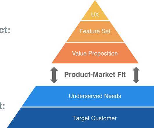
The key message: Focus on solving one problem exceptionally rather than competing on multiple features. The key message: Focus on solving one problem exceptionally rather than competing on multiple features.
I discovered this design challenge on Uxcel , a platform that helps designers develop their UI/UX abilities through interactive challenges. The purpose of this challenge was to design appealing empty state pages for an educational platform. Explain the design decisions behind mychoices. Why Empty StatesMatter?
As always, Tools of the Trade is intended to be educational and does not constitute an official Product Talk endorsement of any of the tools that are mentioned. Ben will then send a direct message to anyone who comments on or reacts to the post, asking them if they would be open to doing a quick Zoom interview.
How do you write a UX microcopy that helps users accomplish their objectives and drives conversions? That’s what our guide to microcopy in UX design covers, so if you’re after the answer, you’re in the right place! In Userpilot, you can use AI to create microcopy for in-app messages and onboarding flows.
You don’t want to send project managers on the ideal path for UX designers, after all. It involves delivering consistent messaging across all channels. Continuously educate users to drive customer success Think of user education like tending a garden – it’s not a one-and-done deal. The result?
What UX trends are shaping the SaaS industry in 2022? There’s no denying that UX design plays a significant role in the design of SaaS products. A UX design trend occurs as a result of a change in user behavior or the adoption of new technologies. Decluttered UI’s are another UX trend.
Imagine a future where lesson planning takes minutes, not hours—this is the promise of AI-driven educational tools. Moreover, based on our results, we collected what you need to know to build a good AI experience for educators. Looking ahead, educators should aim to find the right balance in using AI-driven solutions.
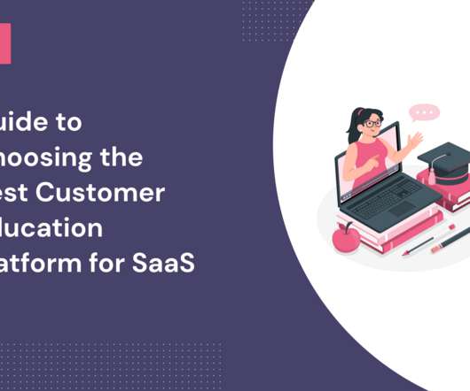
When it comes to choosing a customer education platform, there are so many options to pick from. Customer education is the process of teaching customers how to efficiently use your product to attain their specific goals. What is customer education? What is a customer education platform? More loyal customers.
Wheres the authenticity, the cutting-edge aesthetics or the refined UX that we know customers crave from a premium digitalservice? They want an immersive digital experience that delights, supports, educates andrewards. How toApply: In UX/UI: Surprise users with playful iconography, Easter eggs or custom animations.
The customer onboarding lifecycle is the ongoing process of educating users on your product and helping them achieve success with it. In this article, we explore how to continuously educate and unlock value for your users throughout the customer lifecycle. Effective strategies for primary onboarding: Greet users with welcome messages.
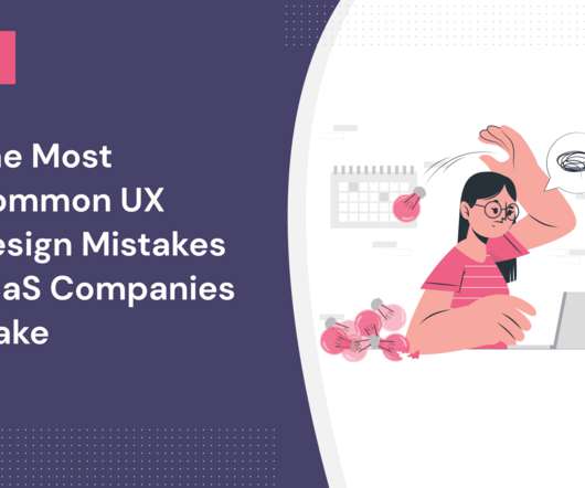
If you’re looking to improve user engagement and experience, start by avoiding some of the most common UX design mistakes. As UX is a crucial element, it’s important for you to know what results in a poor user experience. Avoiding UX debt. What is UX design? Why is having a seamless UX design important?
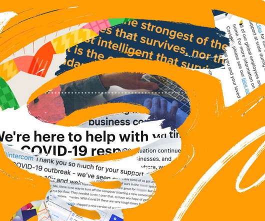
We also used in-app messages to avoid exacerbating already high levels of email fatigue. It’s the little things that you do which ensure your message is received by customers in non-spammy, meaningful ways. Would massively recommend Intercom as a support product – great UX for both sides, and very powerful.??????.
Looking for some good UX writing examples that inspire you to create your copy? In this article, we’ve compiled 14 great examples of product copy and a few best practices UX writers should follow to achieve similar results. Your UX writing should be time and context-appropriate. What is UX writing?
Product communication through in-app messaging is crucial, as it can influence user behavior or promote a new feature. Here are some examples of in-app messaging that will help you make the most of personalized messages and help users feel like you care about their job-to-be-done or JTBD. What is in-app messaging?
Notification UX is critical for the success of your communication strategy and customer experience. Notification UX design best practices: Make notifications valuable by sending the right message to the right user at the right time. For example, when you send a message to a friend on WhatsApp. What are notifications?
Brought to you by: • Eppo —Run reliable, impactful experiments • Airtable ProductCentral —Launch to new heights with a unified system for product development • Sinch —Build messaging, email, and calling into your product — Ivan Zhao is the co-founder and CEO of Notion.
UX mistakes will disrupt the user experience and undervalue your product. This article shows you 14 common UX mistakes designers make, plus how to avoid them and build fantastic product experiences. Optimizing for search engines and not humans While SEO is important, it shouldn’t come at the expense of good UX.
The more your users stick to the happy path UX, the more they’ll see the value in your product and want to stay around. You can make this happen by optimizing the UX for unhappy paths within your product. Besides your error message, use clear CTAs to direct users to possible solutions. What is a happy path in UX?
If you’re a UI/UX designer seeking inspiration, or a product owner aiming to propel your brand into the future, join us on a journey through the design trends of 2024. Moreover, think about leveraging the psychology of color to evoke specific emotions or convey brand messages. So, people will have more possibilities with your product.
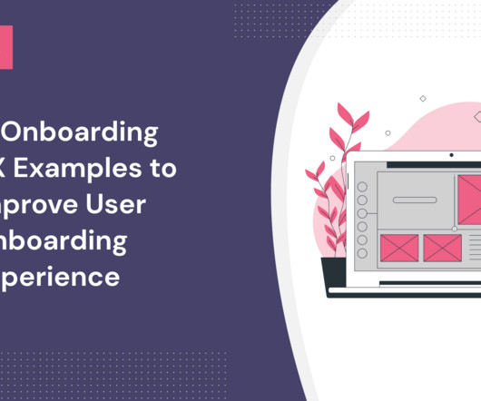
So we’ve collected onboarding UX examples from other companies to inspire you! TL;DR Onboarding UX is the design choices and the layout of the onboarding experience to help produce an excellent onboarding experience. A good user onboarding experience is interactive , intuitive , action-oriented, and educational.
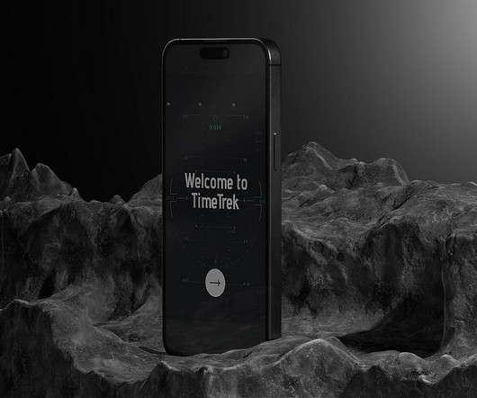
TimeTrek: Crafting a Time-Travel Experience — UX Case Study Imagine if you could travel to any time and place on earth. Warning Note: A clear, cautionary message emphasizes the importance of following the rules, so users don’t alter the history. History of Place Purpose: Offers educational content about destinations.
Getting new users signed up and beginning to get value from your product is a challenge many product managers will face: onboarding UX best practices can help you tackle it effectively. For longer signup processes, use gamification to improve the UX and create fully engaged customers. What is onboarding UX? Ready to get into it?
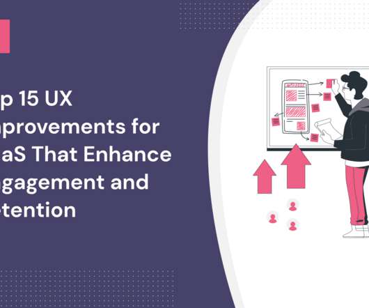
UX design can make or break your product’s success. Poor UX can negatively impact engagement , and conversion rates, and stunt growth. There are many easy UX improvements you can make today to leave a better first impression. In this article, we cover the following: What UX design is and why UX is important in SaaS.
Key Design Considerations: Clear Product Messaging: Users should immediately understand what the software does and how it benefitsthem. Key Design Considerations: Clear Value Proposition: A concise and compelling message communicates why a business standsout. Example Websites: Kulbachny Eli Alcaraz 5.
Instant Messaging communication has also transitioned from chatting on Yahoo Messenger on desktops to conversing with family and friends on Whatsapp groups. Technology has influenced every aspect, from shopping to education to gaming, marking a remarkable paradigm shift. We need a UX world that evolves to shape a better digital future.
So, how can you build trust with UX design ? This article examines the concept of trust in UX design and its importance. It also explores 15 strategies that help UX designers build trust in potential users. Creating a positive first impression with a warm welcome message and data-backed onboarding. What is user trust?
Product experiences should help your team educate and nudge customers through every stage of their relationship with your brand, including onboarding, feature adoption, expansion and growth, product planning, and long-term retention—all while centering on a regular cadence of listening to and acting on customer feedback.
10 Best knowledge base software to educate your customers in 2022. You can set up triggers for automated messages within a chatbot, and an in-app widget can be added to bring your customer-facing knowledge base directly to your customers. Let’s dive in. Userpilot – Best SaaS Knowledge Base Software. Self-service portal.
Ideally, the Love Percent is also a metric that can be tracked over time and over version history to gauge how incremental updates to the app impact the customer’s experience or used as a segmentation tool to message fans and critics in a different manner. Media/Entertainment. This tells us a few things.
Beyond the sprawling knowledge bases and ever-occupied support agents, UX patterns and in-app communication channels help you meet customers’ needs on demand. You can deliver context-sensitive help through various UX patterns such as: 1. UX modals to offer proactive help in a single popup dialog box.
The UX onboarding process is a series of steps a user goes through when they begin using your product. Progressive onboarding is a UX design approach that gradually introduces new users to a product. What is the UX onboarding process? It’s more than just the sign-up process, it continues across the entire user journey.
What's the difference between UX vs CX? UX deals with a user's interactions with specific aspects of your product, while CX is broader and covers all customer engagements with your brand. Read on to find four key differences between UX and CX and how to improve both. That's not entirely true.
The UX is the final effect?—?how gender, age, marital status, income, education) Psychology (attitudes, opinions, values, interests) Behaviour (e.g. Overall, you don’t build any prototype of the product, just messaging around the product. Their goal is to gauge market interests and test your messaging. Messaging?—?the
Lets review its core features: Streamline in-app messaging Pendo Mobile allows teams to create in-app messages to engage users with onboarding flows, feature announcements, and promotions. These messages are designed for onboarding new users , announcing new features, and helping users navigate your product with ease.
Create a resource center with different educational resources based on the user’s jobs to be done. Offer proactive customer support by educating users on new features that are relevant to them. Offer proactive customer support by educating users on new features that are relevant to them. What is proactive help?
Access to education opportunities appropriate to respective disabilities will be easier to enroll in, regardless of school or institution. UI Accessible MessagingMessages in a user interface (UI) that help anyone use software are known as accessible messaging. Be helpful: Show error messages when you can’t fix issues.
The second set of experiments was around educating people on how to re-pin, and the value of a re-pin, and that did actually increase the activation and retention for the business. There’s basically no education at all. I prefer the in-product, contextual education more than a user manual before I even see the product.
Every day, 50,000 students, trainees and educators benefit from the platform. It’s just as important to ensure the UX of the feedback process as it is to ensure the quality of your testing product. But in return, your product can harvest memorable UX and customer loyalty. What kind of feedback should you be looking for?
Get ready to level up your UX design and make the user experience more enjoyable! Preloader vs. loading screen vs skeleton screens Preloaders, loading screens , and skeleton screens all serve a similar purpose in UX design. It has a simple “Loading builder” message and multiple inspirational quotes that run in a loop.
Youll blend the strategic mindset of a growth product manager with the creative vision of a UX designer – driving repeat engagement, gamification, and social participation. A job seeker with 8+ years of experience in product management or UX design, especially for mobile apps or games. Who would be the best fit for this job?
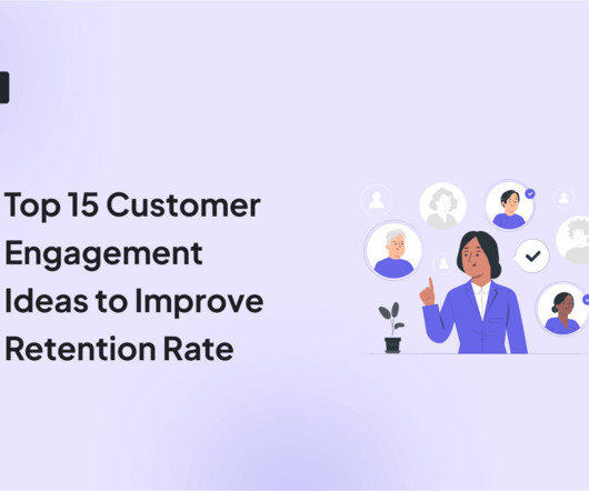
15 creative customer engagement ideas: Personalize the customer experience by tailoring onboarding flows, dashboards, and messaging to specific user personas. Constantly educate customers through product-led content , certification programs, knowledge bases, and webinars. Customer engagement ideas: gamify UX. Its purpose?
By using a specific descriptive element like “blue shirt,” you can convey your message more precisely. It doesn’t start with “image of…” or “picture of…” Starting your alt text with “image of…” is similar to starting your text messages with “This is a text message.” Probably not. Writing alt text is similar. It’s unnecessary.
We organize all of the trending information in your field so you don't have to. Join 96,000+ users and stay up to date on the latest articles your peers are reading.
You know about us, now we want to get to know you!
Let's personalize your content
Let's get even more personalized
We recognize your account from another site in our network, please click 'Send Email' below to continue with verifying your account and setting a password.


Let's personalize your content