This site uses cookies to improve your experience. To help us insure we adhere to various privacy regulations, please select your country/region of residence. If you do not select a country, we will assume you are from the United States. Select your Cookie Settings or view our Privacy Policy and Terms of Use.
Cookie Settings
Cookies and similar technologies are used on this website for proper function of the website, for tracking performance analytics and for marketing purposes. We and some of our third-party providers may use cookie data for various purposes. Please review the cookie settings below and choose your preference.
Used for the proper function of the website
Used for monitoring website traffic and interactions
Cookie Settings
Cookies and similar technologies are used on this website for proper function of the website, for tracking performance analytics and for marketing purposes. We and some of our third-party providers may use cookie data for various purposes. Please review the cookie settings below and choose your preference.
Strictly Necessary: Used for the proper function of the website
Performance/Analytics: Used for monitoring website traffic and interactions
How Rumi Cosmetiques Boosted UserExperience and Conversion Rates in eCommerce: A Case Study for Marketers andManagers Discover how Rumi Cosmetiques achieved a 75% increase in cart adds and doubled conversion rates by enhancing userexperience and conversion rate in eCommerce.
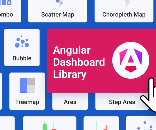
Reveal Embedded Analytics We know how difficult it is to create dashboards, especially for web applications. Thats what dashboards are for. They track everything from user behavior to system performance. In fact, Angular dashboards can provide key insights that will eventually allow data-driven decision-making at your company.
Flexible Chart Legend Positioning: Move and align legends for better dashboard design. is Here: Smarter Analytics, More Control, Better UserExperience and written by Casey McGuigan. Fixed Lines for Charts: Set static reference points to highlight key data trends. Request a Demo Originally from Reveal 1.7.3
A customer sentiment dashboard is a great way to visualize customer feedback and see what users love (or hate) about your product. TL;DR A sentiment analysis dashboard typically integrates information from multiple data sources, such as social media posts, customer reviews, survey responses , and customer service chats.
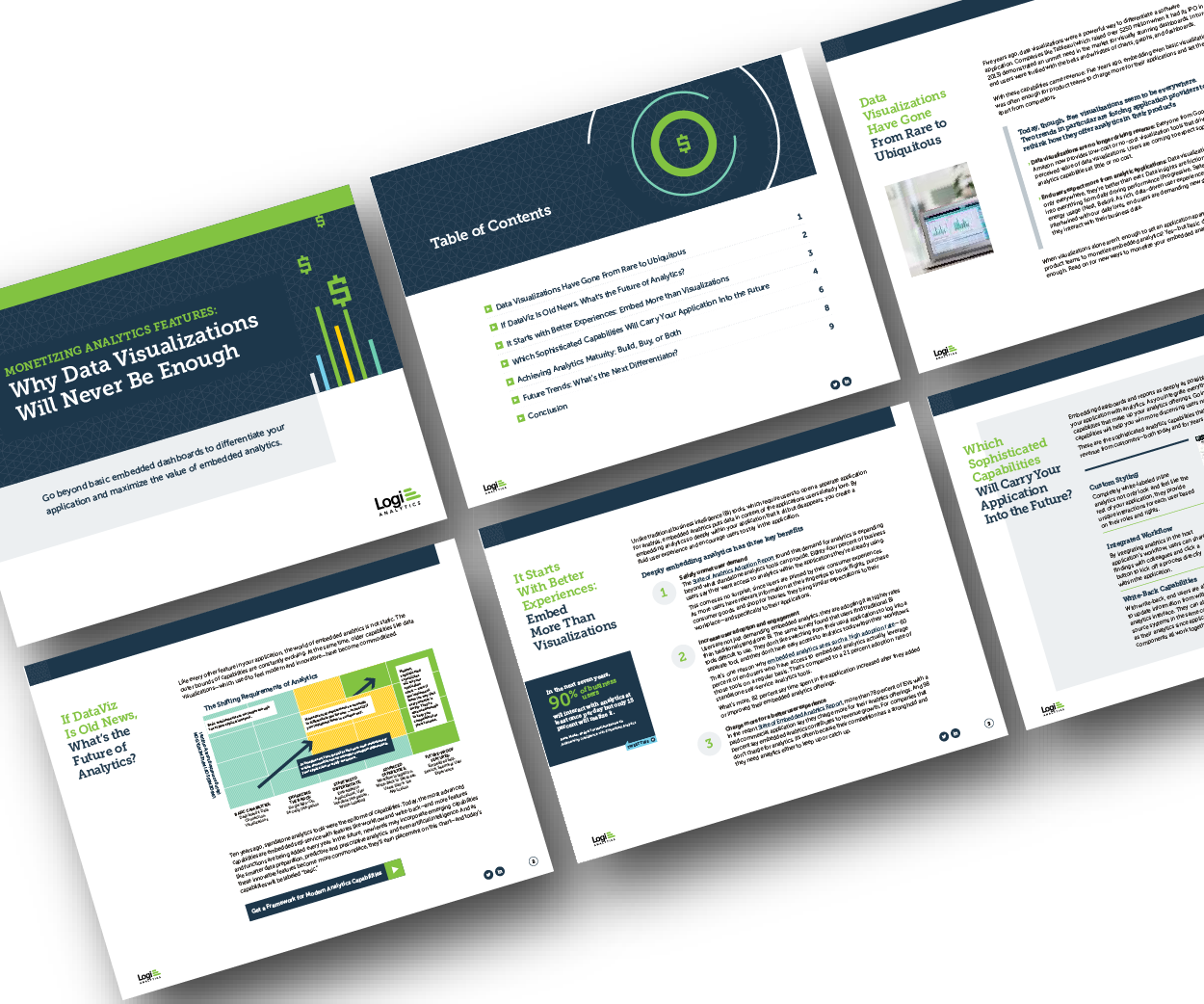
But today, dashboards and visualizations have become table stakes. Think your customers will pay more for data visualizations in your application? Five years ago they may have. Discover which features will differentiate your application and maximize the ROI of your embedded analytics. Brought to you by Logi Analytics.
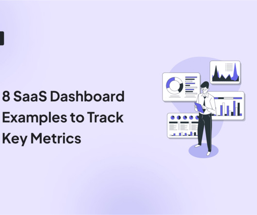
When it comes to product management, you need to look at different SaaS dashboard examples to see what kind of product analytics you can measure, and how. So what are the most important types of dashboards and which ones are the best for you? A SaaS (software-as-a-service) dashboard is a centralized interface within your app.
Variety of UI patterns to engage users, including modals , tooltips , and slideouts. A/B and multivariate testing for optimizing userexperiences. Custom dashboards to track key metrics at a glance. Analytics reports like paths, funnels, and cohort tables for visualizing user behavior data. UserGuiding dashboard.
Choose UX research tools with essential features , collaboration, reliable support , user-friendliness, scalability , integrations , and strong security. Userpilot enhances userexperience through in-depth UX research, offering features to gather, analyze, and act on customer feedback.
Unfortunately, the research backs this up, with a staggering 90% of users reporting that they stopped using an app due to poor performance. Basically, anything that ruins the userexperience. UX analytics involves gathering, analyzing, and interpreting data about how users interact with your product or service.
Dashboard design can mean the difference between users excitedly embracing your product or ignoring it altogether. Great dashboards lead to richer userexperiences and significant return on investment (ROI), while poorly designed dashboards distract users, suppress adoption, and can even tarnish your project or brand.
As today’s user increasingly desires swift solutions when using digital products, userexperience optimization can spell the difference between the success and failure of a product. To retain users, continuous improvement of your UX optimization efforts is critical. Analyze the collected data and prioritize changes.
Functionality is a must when it comes to attracting customers, but it’s userexperience that helps you retain them. Wondering how to create an outstanding userexperience ? TL;DR UX design identifies user needs, wants, and pain points and creates engaging products that enable them to achieve their goals.
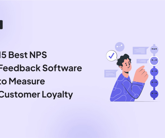
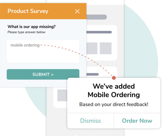
Userpilot’s in-depth survey customization and targeting make it ideal for product teams focused on improving specific user touchpoints and optimizing in-app feedback collection. Plus, the ability to create custom NPS dashboards allow you to analyze the results easily without writing a line of code. A 14-day free trial is available. #8
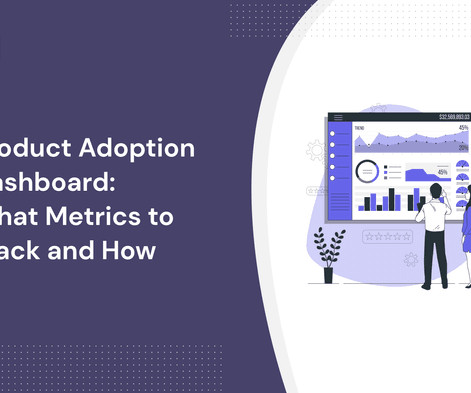
A product adoption dashboard helps you visualize key adoption metrics so you can make data-driven decisions and boost user engagement. In this article, we cover the following: Why you need a product adoption dashboard. Steps to measure adoption using a comprehensive dashboard. Understand how users adopt new features.
In this blog, we explore 5 key principles that exist to ensure you create a relevant dashboard that guides and simplifies the userexperience, makes it as easy as possible to interpret what is presented no matter its complexity, and increases the adoption of BI.
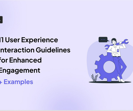
Alongside usability testing, userexperience interface guidelines allow you to build more intuitive and user-friendly solutions. In this blog, we explain eleven userexperience and interaction design guidelines supported by real-life examples to improve product engagement. System status visibility.
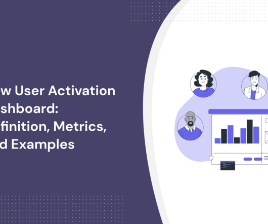
In SaaS, a new user activation dashboard can become a massive product analytics tool to understand and optimize the user journey. But how can a dashboard for user activation can help you engage more users? moment ," impacting user retention and satisfaction.
Website feedback and online surveys : These collect opinions about digital experiences, focusing on usability and content quality. Businesses can use this feedback to improve website navigation, enhance userexperience, and drive conversions.
. – Isa Olsson, UX Researcher and Designer at Zoezi Finally, Zoezi users had no easy way to report issues from within the product. They had to leave the app and use email, which was inconvenient and led to poor userexperience. Zoezi uses Userpilot mainly to: Monitor product usage from the analytics dashboards.
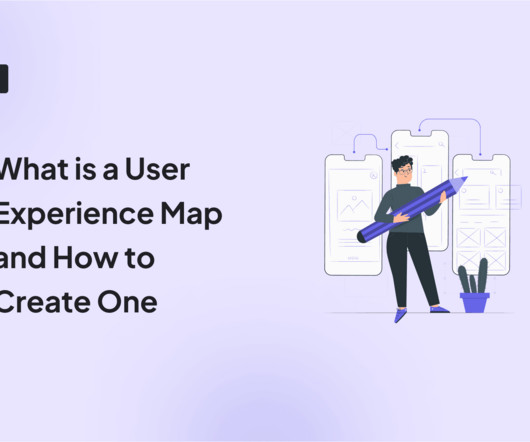
The solution might lie in your ability to create a comprehensive userexperience map. A well-crafted userexperience map can be your secret weapon for understanding customers, identifying pain points, and boosting product engagement. We also identify some best practices to follow when creating the userexperience map.
Get to Know Your User (30 minutes) First things first – who are you solving for? This step is all about understanding who your user is. Example: Imagine you’re designing a new dashboard for a fintech app. ” Perhaps users are spending a lot of time on manual tasks. Big difference, right? Big difference, right?
Userpilot’s Visual Labeler enables you to track in-app user behavior, such as clicks, text input, and form submissions, code-free and with no interference from your dev team. With the product usage dashboard, you can track user engagement metrics, popular pages and features, top interactions, trends, and even browser preferences.
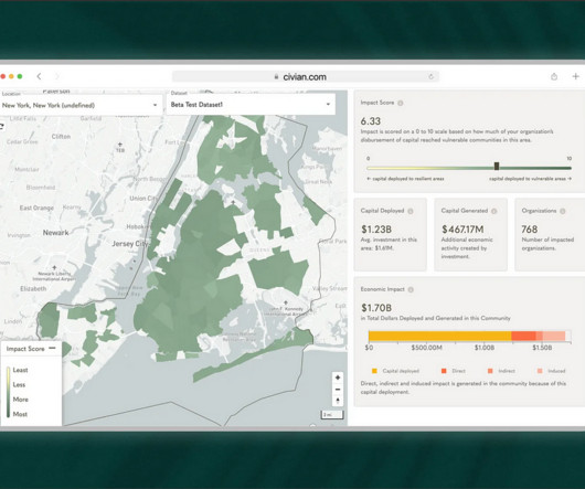
Problem Brief Over a span of 4 weeks, we tested Civians platform and created design solutions to improve the overall userexperience of the dashboard. We also encouraged them to think out loud while they were navigating the dashboard, to help us uncover their mental model and identify hidden insights.
Tighter feedback loops and faster improvements to userexperience. Privacy settings to mask sensitive data Fullstory’s privacy settings allow you to protect user information by masking sensitive data like credit card numbers, passwords, and personally identifiable information within session replays. Custom dashboards.
NPS survey dashboard in UsrGuiding tool. In reality, UX is multidimensional, and it requires multiple qualitative and quantitative metrics like task success rate, user satisfaction score, and summary of user reviews. Such companies rely on user surveys and feedback to evaluate userexperience.
Much of the literature that defines the role as the intersection of business, technology, and userexperience isn't particularly helpful for practitioners who are left wondering what skills they need to learn versus the fine people they work closely with in actual business, technology, and userexperience roles.
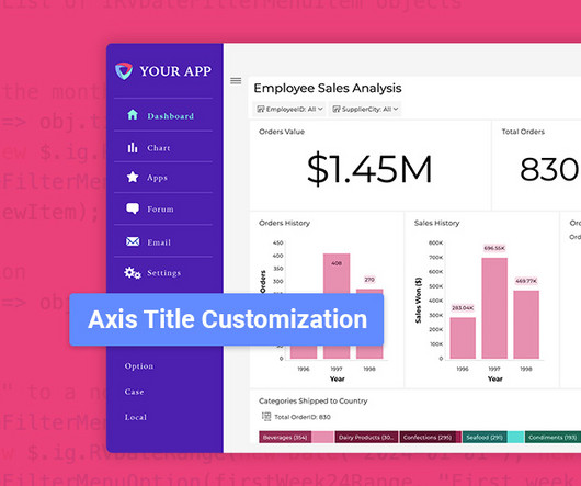
Latest Update Features: Custom Toolbars: Full control over dashboard menus. Custom Toolbar Options: Full Control Over Menus Developers can now fully customize dashboard and visualization toolbars using the revealView.onMenuOpening event handler. Dynamically adjust menu behavior based on user conditions (e.g.,
It combines session recording with other features like product analytics, user onboarding, and in-app surveys, making it an all-in-one solution for understanding and improving the userexperience. Main Features Skip inactivity and jump straight to key user actions within each recording.
Session replay tools for mid-market and enterprises Now, without wasting more time, lets explore the best session replay tools for mid-market and enterprise users: Userpilot Best for : Mid-market and enterprises prioritizing userexperience and in-app guidance. Userpilot is like a Swiss army knife for improving userexperiences.
Userexperience can make or break a web app. If your software is slow or buggy, users wont stick around for long. If youre only finding out about these issues after users complain, youre already too late. Autocapture events dashboard in Userpilot. Build and view custom dashboards in Userpilot.
Instead of guessing what users need, youll have concrete data on which features work, and which dont. Increased User Retention: Understanding user behavior allows you to personalize the userexperience, keeping them engaged for longer. Improve product performance by fixing issues before they affect users.
Inefficient dashboard configuration Traders often leverage dashboards to monitor data from personal accounts, control transactions and contracts, follow the latest currency market trends and shifts. To increase working efficiency, users can tweak dashboards and choose the most topical tabs. for Australia and Japan.
You can build onboarding carousels, push notifications, in-app messages , and surveys from a single dashboard. Everythings optimized for mobile, so your onboarding experience feels native from the start. User onboarding on mobile doesn’t need to be complex or code-heavy. Why choose Userpilot for mobile onboarding?
Usability testing: Observe users as they interact with your product to identify usability issues and collect feedback on userexperience. E.g., Identify navigation issues in your analytics dashboard based on real-time user interactions. Survey results dashboard in SurveyMonkey. Dashboard example in Hotjar.
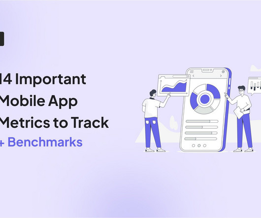
1 Engagement DAU/MAU Understand daily and monthly active user engagement and overall app popularity. 2 Engagement Feature adoption Gauge user interest in new features and optimize feature development. 3 Engagement Average user session length Measure user interactions and identify areas for improved content or flow.
Plus, it connects with the web version so you can track the userexperiences across mobile and web platforms. To start using Pendo mobile, you need to install the Pendo Mobile SDK in your app so it can track all the users data and connect it with the web app. Dashboards. Custom dashboards and reports.
All too often it’s the latter, because they weren’t built to provide a delightful experience. Expectations around userexperience are higher than ever – therefore we need fast and impactful tools. We believe that in the future, the experience of the tools we use at work will be indistinguishable from our personal life.
Both provide insights into user interactions, but Hotjar allows for customizable dashboards and broader Google Analytics integration. Both platforms have help centers and community forums, but Hotjar offers more personalized support for premium users. Microsoft Clarity dashboard. Hotjar dashboard. What is Hotjar?
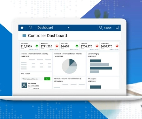
Factors I consider when evaluating customer analytics tools Important core features Analytics dashboards : Provide real-time visualizations of key performance indicators (like active users and page views) at a glance, so you can easily track changes. Example of a Userpilot dashboard showing free trial to paid user conversion rate.
Fast and personal messenger-based conversational support tools that offer a high-quality, delightful customer experience, but which can lack the underlying flexibility to accommodate the complexities of every type of business. Reporting upgrades.
Conversely, if the userexperience heavily relies on a graphic user interface, the larger the gap for the product designer toaddress. While it would be foolish for a product designer to complain about this approach, it can inadvertently exclude important userexperience considerations.
Our SDK is instrumented into mParticle, and when a mParticle customer decides to leverage Apptentive, a switch is flipped on in their dashboard which gives them immediate access to Apptentive. Apptentive also offers “codeless integration” through mParticle, without requiring customers to create a new series of events within their apps.
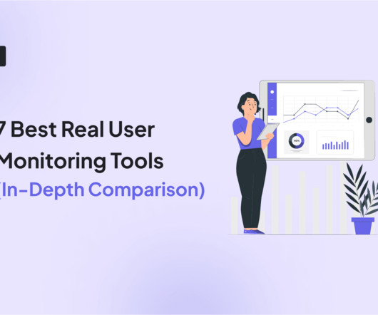
Robust real user monitoring solutions, like Userpilot , capture 100% of interactions, ensuring you see the full picture: every hesitation, every bottleneck, and every Aha moment. How is real user monitoring different from synthetic monitoring? How to set up real user monitoring in 5 steps Setting up RUM doesnt have to be complicated.
Whereas conventional websites may focus on visual aesthetics, SaaS is built around productivity and solving user problems. Userexperience becomes the key driver. Rule #1: Build minimalistic interfaces so that users can focus on tasks rather than learning thesystem. RamosUX/UI design of the digital analytics platform 7.
We organize all of the trending information in your field so you don't have to. Join 96,000+ users and stay up to date on the latest articles your peers are reading.
You know about us, now we want to get to know you!
Let's personalize your content
Let's get even more personalized
We recognize your account from another site in our network, please click 'Send Email' below to continue with verifying your account and setting a password.


Let's personalize your content