This site uses cookies to improve your experience. To help us insure we adhere to various privacy regulations, please select your country/region of residence. If you do not select a country, we will assume you are from the United States. Select your Cookie Settings or view our Privacy Policy and Terms of Use.
Cookie Settings
Cookies and similar technologies are used on this website for proper function of the website, for tracking performance analytics and for marketing purposes. We and some of our third-party providers may use cookie data for various purposes. Please review the cookie settings below and choose your preference.
Used for the proper function of the website
Used for monitoring website traffic and interactions
Cookie Settings
Cookies and similar technologies are used on this website for proper function of the website, for tracking performance analytics and for marketing purposes. We and some of our third-party providers may use cookie data for various purposes. Please review the cookie settings below and choose your preference.
Strictly Necessary: Used for the proper function of the website
Performance/Analytics: Used for monitoring website traffic and interactions
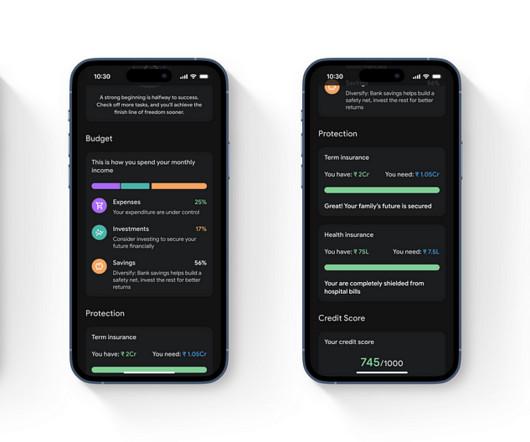
Finance and banking: 85%90%. Established customer relationships and financial product stickiness (customers typically avoid switching to other finance service) lead to high retention rates. Chargebee dashboard for tracking customer behavior (and measuring retention).
Users share sensitive data and entrust performing operations with their finances, so even minor defects in fintech products destroy confidence, make users question the company’s expertise, and what’s worse, abandon an app. To increase working efficiency, users can tweak dashboards and choose the most topical tabs.
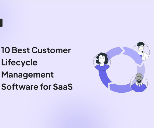
A product analytics dashboard helps you visualize user behavior, so you can make informed decisions on how to improve product engagement. In this article, we cover the following: Why you need an analytics dashboard. The types of metrics to track in your dashboard. The most common analytics dashboards in SaaS.
This is the effect of Dopamine Banking, where finance meets emotions and entertainment, and every tap of your smartphone is engineered to delight and reward. Buckle up, because the future of finance just got exhilarating. From Transactions to Transformations Traditional finance often focuses on functional efficiency and compliance.
Too often companies say they are data-driven but when I actually look inside to see how teams are operating, I hear anecdotes like the following: "I look at dashboards when I get a chance, but there is so much going on that I'm not looking at them regularly." "I The best place to start is not by just throwing together a dashboard of metrics.
Depending on the output, the trailer can appear in different formats – from a one-page project overview to highlight reels, a dashboard, or designs. sharing with product, marketing, sales, and finance teams) and reaching wider to connect with other stakeholders who are keen to collaborate. Screening: Share early and often.
People quickly went digital and understood that finances don’t always require personal presence. Today, the main goals of fintech are to facilitate the interaction with finances and to improve the relationship between financial institutions and customers. Their purpose is simple: to let users store their finances and make payments.
Our SDK is instrumented into mParticle, and when a mParticle customer decides to leverage Apptentive, a switch is flipped on in their dashboard which gives them immediate access to Apptentive. Apptentive also offers “codeless integration” through mParticle, without requiring customers to create a new series of events within their apps.
Communicate findings effectively A well-structured custom dashboard makes it easier for you to share insights across teams. When we launch a new feature, we create a funnel dashboard to measure how many users discover, activate, and keep using it. Looker Studio: Best for creating free, customizable dashboards with Google integrations.
. “The point of tracking sales KPIs is to drive action for our team, not just to display them on a sales dashboard” That’s why I spend much of my time examining underlying KPIs like lead flow, pipeline creation, churn, expansion and more. But KPIs on their own are just numbers on a dashboard.
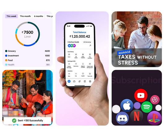
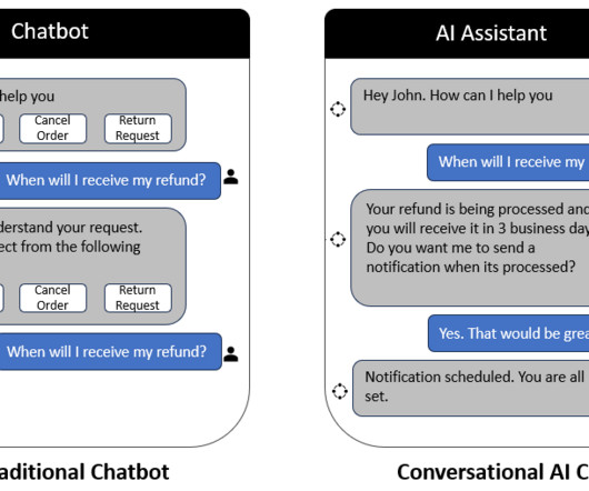
Let’s consider an example from the field of personal finance management. In a traditional finance app, users often need to navigate through multiple menus and tabs to track their spending, set budgets, view their investments, and more. If they’re curious about their investment performance, they could ask, “How are my stocks doing?”
Our SDK is instrumented into mParticle, and when a mParticle customer decides to leverage Apptentive, a switch is flipped on in their dashboard which gives them immediate access to Apptentive. See exclusive 2020 mobile engagement data for finance apps. This saves companies valuable time and resources.
Project Brief The project involves creating a comprehensive finance management app. Why this Industry The finance industry presents a compelling opportunity for designing applications due to the significant and widespread challenges outlined in the problem statement.
It allows gyms, yoga studios, spas, outdoor centers, and personal trainers to streamline day-to-day operations: admin, finance, and customer care. Zoezi uses Userpilot mainly to: Monitor product usage from the analytics dashboards. Userpilot dashboard builder. Zoezi is an all-in-one platform for the wellness industry.
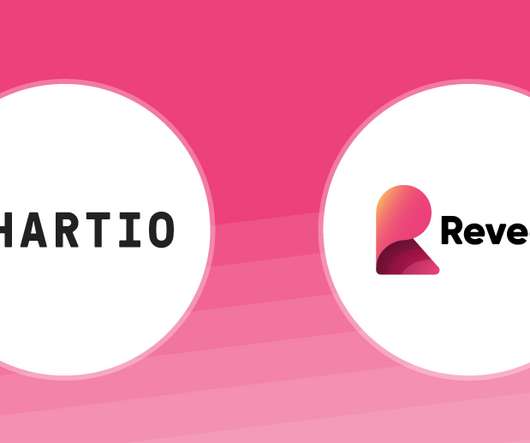
It’s one of the most popular visualization tools on the market that helps decision-makers make refined graphs, reports, and dashboards, and take the best case decisions faster. million charts for 540,000 dashboards pulled from over 100,000 data sources. Or it used to be. Chartio reported that 280,000 users have created 10.5
For example, it is common to hear a bad BPM say they want users to view their dashboard. You are not helping people if someone has to log in every day to check their business accounting system or their personal finances. They value the act of logging in* or time spent and not what someone does when they log in.
Transforming Google Pay with AI: Personal Finance Made Simple and Engaging. Context Many young professionals struggle to manage their finances due to a lack of personalized tools and knowledge. Switching between multiple apps to manage finances. Pain Points Identified Manual data entry is time-consuming.
Have built-in and custom analytics dashboards for easy data visualization. Dashboards for customer data analytics. You want this tool to have a centralized dashboard or report to view your metrics in data analytics charts , but also see progress toward goals. Review user data on Userpilot’s main dashboard.
Mixpanel offers advanced user analytics , customizable reports, and an intuitive analytics dashboard. Product analytics : Userpilot’s comprehensive analytics allows you to track customer behavior through funnel analysis, path analysis, heatmaps , and dashboards – gaining deep insights into user interactions.
No-code tool for event tracking, reports, and custom dashboards. Behavioral data analysis with an interactive dashboard. Set and track events, view everything in a centralized dashboard, and build reports to share with stakeholders. Dashboards. Key features : Centralized dashboard. Analytics capabilities.
Customizable, no-code analytics dashboards with ready-made templates—similar to LogRocket. It’s an excellent fit for large enterprises (including finances, Ecommerce, travel, insurance, and more) looking for deep session replays and journey analytics. 5 Glassbox dashboard. 5 Pendo’s dashboard. G2 rating : 4.9/5
Leverage cross-app executive dashboards and journey orchestration to refine engagement strategies. Heres what that looks like in action: Pendo dashboard showing in-app message pop-up. Cross-app analytics: Larger teams benefit from cross-app executive dashboards, giving them a holistic view of engagement across multiple products.
Ideally, with a great onboarding flow, when someone asks one of your customers what their favorite part of managing their finances is, they hold up their phone and say “the app I use.” Set up a customizable dashboard for your KYC onboarding process to access the data easily and monitor it over time.
Specialized Reports In healthcare , finance, and manufacturing industries, specialized reports are often required to meet regulatory standards or specific business needs. With our innovative addition to the platform, you can now take control of the chart types available within your dashboards. But that’s not all.
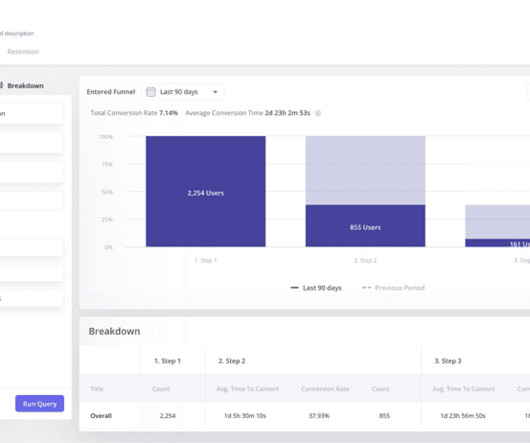
After launching a new feature called “Activity Dashboard,” MINDBODY used a funnel analysis to see how the addition impacted their conversion goal: booking classes. They found that users who engaged with the Activity Dashboard had 24% more classes booked per week. Financial Services Funnel Analysis.
Challenges: Legacy infrastructure Technical resources needed for implementation Constantly changing analytics needs Existence of internal analytics tools Building user adoption & getting users to overcome their fear of data Bad data visualization and dashboard design practices The build vs buy dilemma Justifying the cost.
We have robust models for industries such as retail and ecommerce, finance, travel and hospitality, subscriptions, and all other areas from utilities to healthcare and telecoms. Dashboards and Reporting: Alchemer helps you set up dashboards and reporting based on your specific analytics needs.
Banking CRM Crypto Education Finance Healthcare Insurance IT Manufacturing Real Estate Retail Supply chain Telecommunications Security Logistics and delivery Marketing Airlines Hospitality Weather forecast Agriculture SaaS Government Sports. Finance: Shape future strategies and improve the decision-making process in real-time.
Most cybersecurity professionals start their day in the Threat Intelligence Dashboard. Start your day with a general overview of the threat landscape with the Threat Intelligence Dashboard. Here is an example of how a cybersecurity professional might ask Leo to track all the cyber attacks targeted at the finance industry.
Marketing resource management (MRM) is a system for managing marketing resources, including digital assets, finances, staff members, and external vendors. They help you track performances for set goals and OKRs by generating easy-to-understand dashboards and reports. Notion dashboard. What is marketing resource management (MRM)?
WalkMe dashboard – Source: WalkMe. Whatfix Dashboard – Source: Whatfix. While WalkMe has a user-friendly dashboard for viewing onboarding data and analytics, Whatfix has quite limited analytic capabilities. Whatfix analytics dashboard. Create basic user segments with branching walkthrough experiences.
To analyze NPS responses, visualize the data on a dashboard , track changes to the score over time, tag and categorize open-ended responses , and perform a root cause analysis. Visualize the NPS data on a dashboard Get a unified view of your NPS data with a dashboard. Visualize NPS data on a dashboard in Userpilot.
Represent product to all the other functional stakeholders in marketing, sales, finance, and support. It can entail creating an automated dashboard. With the dashboard, frequently consulted data is readily available in the most used slices and dices. The product operations manager also assembles data from multiple sources.
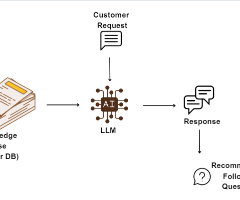
There’s a potential downside to AI chatbots in finance. Much like how many banks embraced dashboards in the past, the next 12 months are likely to witness a surge in banks adopting conversational AI interfaces. Large Language models tend to generate incorrect information, a phenomenon referred to as “hallucination.”
This was based on data from 62 B2B companies collected with Userpilot’s New User Activation dashboard. In contrast, finance and insurance are highly regulated industries. What is the average activation rate for SaaS companies? The average activation rate is 37,5%, and the median activation rate is 37%.
And finally, for analytical skills, they want to make sure you understand the math behind dashboards, A/B testing, etc. Many MBA programs also are analytically rigorous, often through finance and stats classes, ensuring students come with those skills.
One of your first hires should be someone who can nerd out on your company’s finances. It was essentially just this static dashboard. I’m not a finance guy; I was doing the numbers every month enough to show that we still had money in the bank. But it still wasn’t anything good.
Stakeholders across the organization, including marketing , sales, product managers , customer success teams, finance, and senior leaders , monitor the CAC payback metric to optimize strategies and inform decision-making. Features & Events dashboard in Userpilot. What is a good CAC payback period for a SaaS business?
In today’s modern business world is surprising that many retail, banking , finance , and manufacturing organizations still use legacy systems despite the fact that they need to be armed with real-time, up-to-date technologies and tools to be able to survive in the market. What Are The Major Issues With Legacy Systems?
With very fewer peer interactions, these humble entrepreneurs are able to master the must-haves of their businesses like social media management, website development, and finance with powerful tools and resources. You can schedule content across your social media channels and monitor the performance through the dashboard.
Custom analytics dashboards. Check out how your core product metrics are performing in real-time on your dashboard. However, I wish their reporting capabilities and dashboard building were more robust in the platform.” Look at what ChurnZero user, Mike S. We’ll focus on the customer success hub. Sounds good?
One month after someone joins our product team, we give them a short training where we look through the basics of our finances, like where our revenue comes from and how we spend our money. Our team members also have access to our financial analytics tools, like our Stripe dashboard and our own internal admin panel.
We surveyed almost 300 support leaders across a range of industries including software, finance, retail, and education to discover the key trends emerging in the customer support space. Support metrics on their own are just numbers on a dashboard. Learn, optimize, iterate. They only become meaningful when you dig deeper.
It’s important beyond the product team – the speed of R&D is, at the very least, affected by the speed of our surrounding functions, whether that’s finance for giving us headcount or marketing for bringing us to market. ” Paul: I don’t have a dashboard, but Darragh and I will look at key things, for sure.
We organize all of the trending information in your field so you don't have to. Join 96,000+ users and stay up to date on the latest articles your peers are reading.
You know about us, now we want to get to know you!
Let's personalize your content
Let's get even more personalized
We recognize your account from another site in our network, please click 'Send Email' below to continue with verifying your account and setting a password.


Let's personalize your content