This site uses cookies to improve your experience. To help us insure we adhere to various privacy regulations, please select your country/region of residence. If you do not select a country, we will assume you are from the United States. Select your Cookie Settings or view our Privacy Policy and Terms of Use.
Cookie Settings
Cookies and similar technologies are used on this website for proper function of the website, for tracking performance analytics and for marketing purposes. We and some of our third-party providers may use cookie data for various purposes. Please review the cookie settings below and choose your preference.
Used for the proper function of the website
Used for monitoring website traffic and interactions
Cookie Settings
Cookies and similar technologies are used on this website for proper function of the website, for tracking performance analytics and for marketing purposes. We and some of our third-party providers may use cookie data for various purposes. Please review the cookie settings below and choose your preference.
Strictly Necessary: Used for the proper function of the website
Performance/Analytics: Used for monitoring website traffic and interactions
One practice that both companies established was weekly executive-level metrics reviews. I've come to believe that establishing such a metrics review meeting is critical for developing an effective data-driven culture and I wanted to share some of the best practices around doing so. Why metrics reviews matter.
In one of the keynotes of this year’s MTP Engage Hamburg, Johanna Kollmann reviews established system thinking concepts and applies them to the world of today’s product management. Practical Ways of Understanding Systems. As soon as a system is understood, we can try to change or improve it. Systematic Improvement.
Fintech software represents specific challenges due to diverse dynamic content, graphs, tables, and more. Non-transparent system response Imagine a case: after starting an operation, the system stops responding. To increase working efficiency, users can tweak dashboards and choose the most topical tabs.
Over the course of the past year, the customer support landscape has changed for good. The most immediate change that took place due to the pandemic was the increased volume of customer or sales queries,” says Austin Guanzon, Overseas Manager and Product Specialist at Dialpad. “As
You can review Pendo's analytics in their free trial, which displays various different graphs on the basis of dummy data. If you sign up for a trial with Pendo, you are asked whether you initially want to explore Behavior Analytics , Dashboards, or Guides. 26% of customers went to the Dashboard next, and 16% went to Contacts.
Obviously we’re biased (though I would point you to the reviews on G2 Crowd to show that we’re not that biased) but Intercom is the backbone of our entire marketing stack. For example, if your live chat tool doesn’t integrate with your CRM and requires four different people to move leads from one system to another, you’ve got a problem.
It’s the synergy between design elements, functions, features, and of course usability. Dashboard/Admin Panel This feature is perhaps the most common one as a dashboard or admin panel is present on any type of mobile app and not just on insurance ones. Let’s begin. However, the technicalities are best left to the experts.
For example, if they are building an online education platform, they may define the ideal key behavior in concrete terms like, “Add online course schedule to their calendar, right after signing up for the course” or “Get to min 30 or 40 in their first online course.”. A Good Behavioral Product Manager Reviews Existing Research.
Of course, some of the tools/processes we cover and recommend may need to be modified to work for your organization/team but we believe the core principles can apply to a wide range of products and organizations. Review company documents and presentations. We stopped using the system within a month. Do your research.
If you’re a fan of the kanban system , this will become your go-to method of organization. From your dashboard, you’ll be able to see your own tasks and organize them however you’d prefer. What it is: Asana is a versatile task management solution that allows you to manage both personal and team projects.
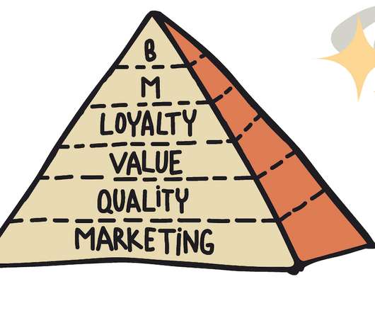
there are many ways to connect and organize metrics and dashboards. And respecting the main product metrics hierarchy rule , of course. How to make metrics pyramid work Classification is a magic word when it comes to an effective metrics system. Metrics Pyramid, Metrics Hierarchy, Unit Economy, Funnels?—?there
On the hunt for the best instructional design software to create course content and engage learners? TLDR; Instructional design software helps you create custom eLearning courses and training material. TLDR; Instructional design software helps you create custom eLearning courses and training material. Let’s go!
Customer health dashboards are one of the critical keys to durable revenue growth. At its heart, a good dashboard can summarize tens or hundreds or even thousands of metrics on customer experience into one simple, impactful snapshot of sentiment and behavior. Step #3: Design the Dashboard. Step #2: Assemble the Team.
Analytics dashboards : Find essential adoption metrics, such as the number of active users , user sessions , average session duration, etc., You can also create custom dashboards using metrics of your choice. Userpilot’s analytics dashboards. GA dashboard. Mixpanel’s dashboard. Cohort tables in Userpilot.
Over the course of my product development career, I’ve developed the following hypothesis: “If I focus more on utility and usefulness, and less on a silver bullet of value, then I will solve more meaningful problems for customers, bridge more gaps and unlock more revenue for my company.” Why is that? Excel is not a pretty product.
Adam: Thank you, it feels a bit surreal still, mainly due to just how quickly the company has gone from seed to series, all in under a 12-month span. It allows companies to prove their real-time security posture just about any day of the year, so it accelerates their sales cycles and security reviews. How does that feel?
Reference values CRR varies widely across industries due to differences in customer expectations about business. How to collect data forCRR The most reliable source for collecting data for CRR is your Customer Relationship Management (CRM) system. Chargebee dashboard for tracking customer behavior (and measuring retention).
Apache Kafka), distributed systems, and much more. ? If you don’t know it already, Mode is a data science platform that brings together a SQL editor, Python notebook, and R where you can perform data visualization, create charts and dashboards, and then share your analysis with a click. 1 Data Science Courses by Codecademy.
This is one of the most popular chatbot and ticketing systems that leverages AI. Product tutorials You can make videos, interactive demos, online courses, or detailed guides with imagery to explain your product as a whole. Userpilot ‘s resource center view from the dashboard. Review your analytics after each initiative.
When tools and systems are not created with them in mind, they lose trust and understanding. We can create empathetic, intuitive systems When everyone on the team is empowered to understand data, they can make more informed decisions and measure their own success. Strategy 2 — Systems. It doesn’t have to be this way.
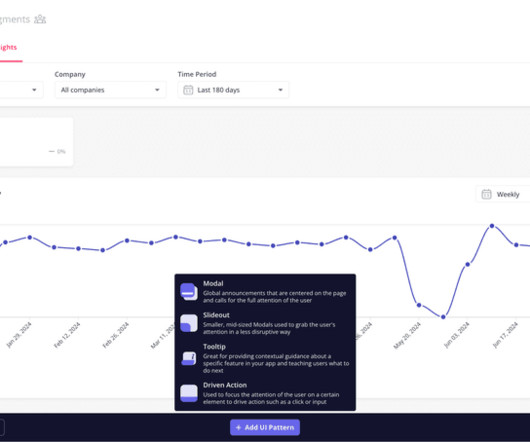
System status visibility. System design matching real-world experience. System status visibility Offer visibility of what’s happening in the system to spare the user’s frustration. You can build banners, alerts, and in-app messages with Userpilot to offer system status visibility.
Pendo Dashboard. Pendo review. The data visualization and analysis options in Data Explorer, Dashboards and Reports can feel limited and a bit “canned.” A review of Pendo. Dashboard in Amplitude. One of Pendo’s highly valued features is the ability to analyze historical feature performance.
Silos most often occur due to company culture, organizational structures, IT deployments, or mergers and acquisitions. Even organizations with existing systems for managing data could fall victim to data silos if individuals or departments go rogue. Due to the wide variety of software solutions, some data could fall through the cracks.
Tools reviewed: Userpilot, UserGuiding , Chameleon , Help Scout, TalentLMS, Skilljar, Docebo, Intellum, and SAP Litmos. We’ll provide a detailed review of some of the top products later. Customer course feedback opportunity. Let the reviews (below) and a demo trial convince you. And to maintain the system.
It enables you to collect user insights with in-app surveys and analyze them with an intuitive dashboard. There are many advantages in establishing a customer feedback system such as: Drive customer success : the more you know about users’ needs and their pain points, the better you can help them achieve their goals.
By managing systems and processes, product operations ensures timely, audience-appropriate communication. In addition, they own the tools and systems that support the process at every stage. Product knowledge is obvious for a product manager, of course. Can we reengineer this system or process for greater efficiency?
Dashboard in Heap. G2 reviewers give Heap an average score of 4.3, Heap vs Pendo: Heap Review. Another reviewer echos that: I have been able to use Heap to analyze the usage of my product features. Heap vs Pendo: Heap Review. It supports both mobile and web-based applications. which is a pretty solid result.
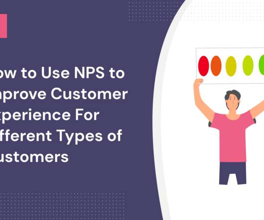
In this article, we’ll cover: What the net promoter score is and how the net promoter system works? To improve the customer experience for detractors: Always respond to negative feedback on 3rd party review platforms to clear the air and also close the loop. Ask them to leave positive reviews and drive word-of-mouth referrals.
Review your technical and non-technical requirements to establish whether you have the expertise needed to deploy embedded analytics. White labeling is the ability to embed reports, dashboards, and data visualizations to match your own unique application’s fonts, colors, and overall brand theme. So, don’t settle for anything less.
That stereotypical image of a room teeming with monitors and elaborate dashboards where all the decisions are made isn’t real, and it’s high time we move away from it. The easy way to think about it is thinking about what you see in caricatures on movies and stuff, like rooms full of dashboards and charts where people are making decisions.
We had the opportunity to answer several questions during the session but there are always many more that we simply can’t get to, and of course there are always a few that we wish we had answered better. There are three ways in which scripts can be used in eG Enterprise: To add new monitoring capabilities into the system (e.g.,
However, they are mostly addressing data-scientists or -engineers, which are, of course, the first personas that feel the pain of managing multiple models. A revolution in observability that has risen due to new technology from companies such as New Relic. In terms of cost, maintaining core-DS production is quite expensive.
The more loyal customers you have, the higher the likelihood of word-of-mouth marketing due to customer advocacy. Of course, personalization is only possible if you have the right user segmentation systems in place. Here’s an example of the types of questions you can set up with Userpilot’s survey dashboard: 7.
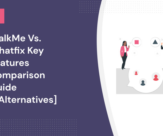
Neither platform publishes its pricing information, but user reviews indicate that WalkMe starts at around $9,000 per year and Whatfix at about $1,200 per month. WalkMe dashboard – Source: WalkMe. Whatfix Dashboard – Source: Whatfix. Whatfix analytics dashboard. However, Whatfix is more accessible to SMEs.
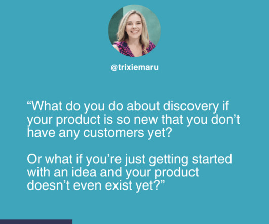
Jess had a similar observation: “I’ve found that the more targeted I can get in my outreach (specific search tool to help filter people), the more likely people are to engage with me, and of course the more relevant and useful that conversation is to supporting our discovery.” Click the image to see a larger version.
‘I thought it was a mistake,’ said the other. […] Indeed, the move turned the course of the game. 🤖🤖🤖🤖 Setting goals: Significantly impacted The job: Picking KPIs, setting goals, drafting OKR docs, and creating dashboards to track these metrics. ‘But today I am speechless.’
The size of our workforce grew, increasing the load on the existing system. From the start, we knew this was an opportunity to build a system that provided plenty of useful analytics, and we needed a way to see them, so we developed a reporting dashboard.”. Analytics can be filtered by system, team, issue, and request type.
Basically, you need to break down your users’ journeys into smaller steps – as many as you can identify and measure – and generate a detailed funnel or growth KPI dashboard. Here’s an example of what a simple dashboard might look like: Source: mattyford.com. Review and Social Proof Tools. Session recording tools.
system developed to catch depressive behaviour early on and help reduce the emergence of severe mental illnesses. Big data entering practice’s operations can possibly turn healthcare into health prediction – with that we could save 50% of the global healthcare budget due to the current inefficient processes. Educational technology.
Naturally, it is not only about the software (~learning how to use Figma), it teaches you many general design lessons and also helps you establish a basic design system. Kickass UX provides you with a Figma workbook designed to guide you through the main phases: you should complete the exercises to get most out of this course.
You can review incoming knowledge and see how it gets mapped on a canvas that covers all of the four key product risks: Viability, Feasibility, Desirability, and Marketability. You can even sync that data with your Miro board for a joint session with your team, and sync changes back, of course. Explore is where it gets fun.
Citrix administrators often struggle with managing logon times effectively, mainly due to the complexity of their environments and the various components that need to be performing optimally. User connections and application launch can fail due to a problem user-side, server-side, or somewhere in the middle.
Our first pet sitters were vet students from the University of Sydney because, of course, they all love pets and they all have some spare time and an interest in making money. Mouahbi : The beautiful thing about Mixpanel is it’s a visualization dashboard, and there’s not too much extra that needs to be done.
Editor’s note : Speaking of performance metrics, product managers and product marketers can visualize important KPIs on Userpilot’s analytics dashboards. They can populate existing dashboards or create custom ones to suit their needs. Product usage dashboard in Userpilot. Book a demo to learn more. Localization in Userpilot.
We organize all of the trending information in your field so you don't have to. Join 96,000+ users and stay up to date on the latest articles your peers are reading.
You know about us, now we want to get to know you!
Let's personalize your content
Let's get even more personalized
We recognize your account from another site in our network, please click 'Send Email' below to continue with verifying your account and setting a password.


Let's personalize your content