This site uses cookies to improve your experience. To help us insure we adhere to various privacy regulations, please select your country/region of residence. If you do not select a country, we will assume you are from the United States. Select your Cookie Settings or view our Privacy Policy and Terms of Use.
Cookie Settings
Cookies and similar technologies are used on this website for proper function of the website, for tracking performance analytics and for marketing purposes. We and some of our third-party providers may use cookie data for various purposes. Please review the cookie settings below and choose your preference.
Used for the proper function of the website
Used for monitoring website traffic and interactions
Cookie Settings
Cookies and similar technologies are used on this website for proper function of the website, for tracking performance analytics and for marketing purposes. We and some of our third-party providers may use cookie data for various purposes. Please review the cookie settings below and choose your preference.
Strictly Necessary: Used for the proper function of the website
Performance/Analytics: Used for monitoring website traffic and interactions
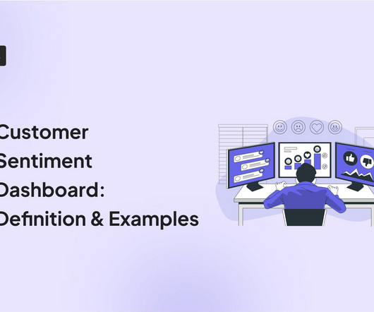
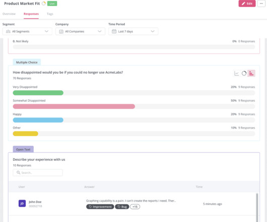
A customer sentiment dashboard is a great way to visualize customer feedback and see what users love (or hate) about your product. TL;DR A sentiment analysis dashboard typically integrates information from multiple data sources, such as social media posts, customer reviews, survey responses , and customer service chats.
A little investigative research on G2 uncovered the top 5 analytics UX mistakes made by SaaS vendors. Users describe this overall poor UX experience in multiple ways: A time-consuming process Too difficult to learn Clunky and confusing interface Insights are spread out across multiple sections 2.
Analytics dashboards are visualization tools that give you an overview of key metrics. In this article, we’ll discuss 10 analytics dashboard examples. It will give you a better understanding of the type of metrics to monitor in your dashboard and help you draw product growth insights from them. Book a demo to learn more.
A product analytics dashboard helps you visualize user behavior, so you can make informed decisions on how to improve product engagement. In this article, we cover the following: Why you need an analytics dashboard. The types of metrics to track in your dashboard. The most common analytics dashboards in SaaS.
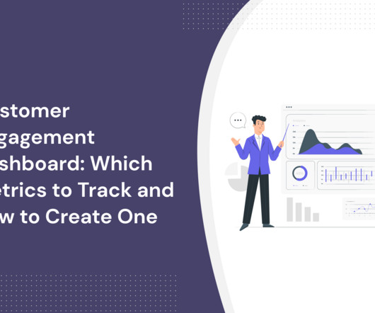
A customer engagement dashboard is invaluable for interpreting customer data and making the right business decisions. Read on to learn how to choose the right engagement metrics for your dashboard and how to build one code-free. User engagement dashboard tools to consider: Userpilot, Amplitude, and Mixpanel.
Wondering how an NPS dashboard can help you track customer loyalty? This is where the NPS dashboard comes in. Let’s see how the dashboard can help you extract insights from NPS responses and improve customer loyalty. What is the NPS dashboard? Why do you need an NPS dashboard?
How do you write a UX microcopy that helps users accomplish their objectives and drives conversions? That’s what our guide to microcopy in UX design covers, so if you’re after the answer, you’re in the right place! What is microcopy UX? Why is it important to write a great UX microcopy?
Understanding and addressing user problems is a fundamental aspect of effective UX design. In this blog, we’ll discuss a few techniques and tools to identify user problems. Digging deeper into user problems helps UX designers identify user pain points and create experiences that fulfill their needs. Dashboard in Userpilot.
What UX trends are shaping the SaaS industry in 2022? There’s no denying that UX design plays a significant role in the design of SaaS products. A UX design trend occurs as a result of a change in user behavior or the adoption of new technologies. Decluttered UI’s are another UX trend.
E.g., Identify navigation issues in your analytics dashboard based on real-time user interactions. Userpilot is one answer, offering data collection and analytics features for quantitative and qualitative data, along with a custom analytics dashboard for visualizing your unique data and responses. Dashboard example in Hotjar.
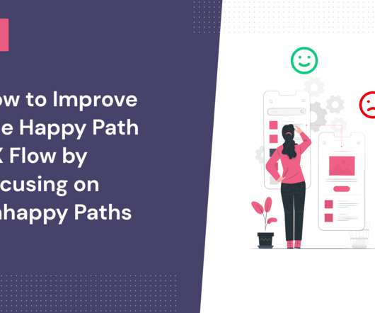
The more your users stick to the happy path UX, the more they’ll see the value in your product and want to stay around. You can make this happen by optimizing the UX for unhappy paths within your product. What is a happy path in UX? What is the unhappy path in UX? Tinder’s critical flow UX example.
Notification UX is critical for the success of your communication strategy and customer experience. Notification UX design best practices: Make notifications valuable by sending the right message to the right user at the right time. Source: Slack notification UX. Source: Calendly notification UX. Let's take a look.
What's the difference between UX vs CX? UX deals with a user's interactions with specific aspects of your product, while CX is broader and covers all customer engagements with your brand. Read on to find four key differences between UX and CX and how to improve both. That's not entirely true.
We were so inspired by Tali’s enthusiasm that we just had to share her story here on the Product Talk blog. To prepare for the workshop, Tali created a fictional case study, and with the help of ChatGPT, she generated six interview snapshots and some analytics dashboards. Do you have your own Product in Practice you’d like to share?
UX/UI Design and Research Teams Can Use Userpilot to: Recruit Users for Usability Tests with Usage Analytics and Segmentation Collect User Feedback with In-App Surveys Understand Product Usage with Product Analytics Get a Demo 14 Day Trial No Credit Card Required What is a business intelligence analyst? Book a demo to see it in action!
Things seem great initially, but soon enough, you see your analytics dashboard showing a constant decline. Poor UX: If your app is difficult to navigate or lacks a clear layout, users wont hesitate to abandon it. The UX should feel intuitive and seamlessly guide users through the app. Create mobile slideouts with Userpilot.
Their tightly packed visual dashboards organize the data in a way that makes it easy to map out sales funnels, track common paths, uncover behavior patterns, and identify friction points. As a mobile-friendly solution, UXCam’s offers push notifications, so your support and UX teams can connect with specific user segments more easily.
It’s just as important to ensure the UX of the feedback process as it is to ensure the quality of your testing product. But in return, your product can harvest memorable UX and customer loyalty. They are looking for UX defects and identifying missing elements to close the expectation gap. “We
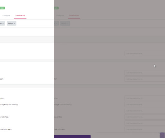
Miruna Parchirie , the Localization Manager at Kudo, believes that a successful localization project requires more substantial changes to the UX to have the desired impact on target users: Localization is like storytelling: you have a message to convey, and you want it to be impactful, to strike the right chord. Lokalise project dashboard.
Like Appcues, Userpilot allows you to track goals from the Goals dashboard after you set them from the Chrome extension. The NPS dashboard in Userpilot is more detailed. Appcues offers a range of analytics features that help product managers, marketers, and UX designers gather insights into user behavior within their products.
In this blog, we explain eleven user experience and interaction design guidelines supported by real-life examples to improve product engagement. UX/UI consistency and standards. Jakob Nielsen introduced these in the early 90s to standardize what a good UI/UX meant. Control and freedom for users. Recognition instead of recall.
Mention is a media monitoring tool that enables collecting user feedback from online conversations across various platforms, like social media, blogs, forums, and news sites. Product teams can use Mixpanel to create tailored reports and dashboards to facilitate data-driven decision-making. Product feedback software: Mixpanel.
Unify your data to deliver better customer experiences : You can combine data using the flexible and customizable HubSpot marketing dashboards to see the initiatives that yield the best results for your business. For instance, the dropdown menu will show the names of specific blogs or landing pages where the CTA is.
For example, work with the UX team to conduct joint user research, or collaborate with the data team to build dashboards and metrics. Invest in learning about product management best practices, whether through books, blogs, podcasts, or training programs. Start small and iterate.
Here are the key features to look for in an analytics tool: segmentation, tracking capabilities, A/B testing , and data visualization with analytics dashboards. Mixpanel is a marketing analytics tool that imports data and transforms it into visual and interactive dashboards. A/B tests are excellent tools for instant customer feedback.
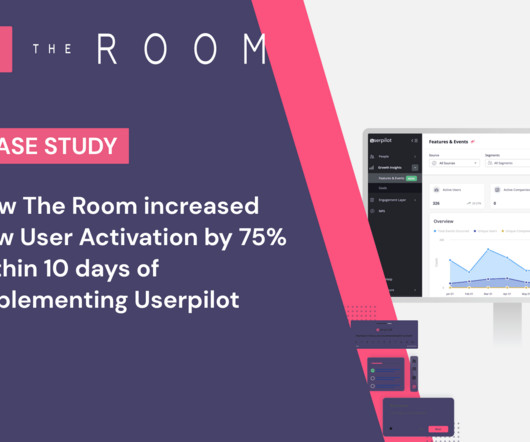
The engagement analytics for the tagged feature are available on Userpilot’s dashboard: The Result: 75% more CV uploads within 10 days of implementing Userpilot “The number of CV uploads went up from 200-210 to 300-350 CV uploads per week after using Userpilot for 10 days.” – said Arjoon.
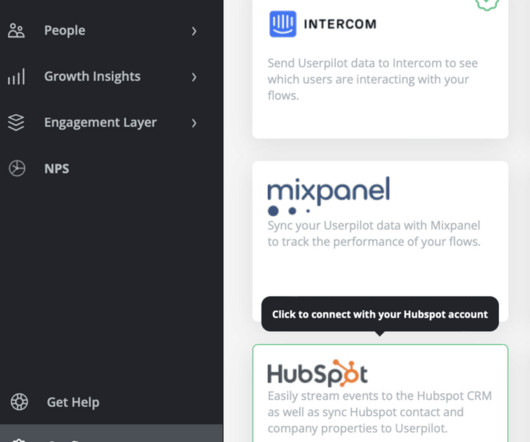
You can enhance HubSpot’s custom reports and dashboards with product and user behavior data tracked in Userpilot to gain a comprehensive understanding of customer needs and preferences. All the data is relayed in real-time so all the reports and dashboards will be up-to-date. Hubspot custom dashboard.
You can interpret survey responses using survey analytics dashboards to visualize data, response tagging to discover feedback trends, and cross-referencing results with behavioral data to better understand user interactions. Thus, you can use a survey analytics dashboard to view details like survey results, dismiss rate, completion rate, etc.
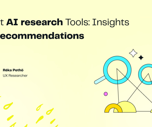
Our blog post guides you through the maze of AI research tools. Then, we rigorously tested AI tools for UX research to evaluate their suitability for future integration and also to understand their current limitations. This blog post is not about AI tools in general but specifically about UX research tools.
Another option is gathering feedback directly: launch UX , NPS, or other surveys at relevant stages in the journey to gather direct insight from your customers. Filter questions seamlessly to your UX (or customers might feel bombarded before they’ve even had the chance to orient themselves). Be careful to get the balance right.
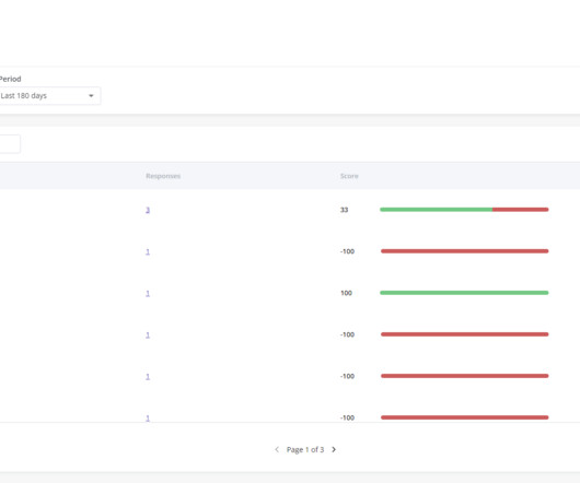
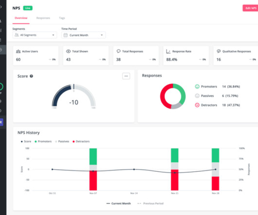
For example, an NPS dashboard helps you to easily visualize the number of promoters, passives, and detractors you have. Userpilot’s NPS dashboard. Userpilot provides a dashboard to help you easily analyze and visualize your survey responses. Userpilot survey analytics dashboard. Talkwalker dashboard 3.
TL;DR Pendo is a product growth platform for product , marketing , customer success , and UX design teams. Pendo dashboard. UX designers – to analyze user engagement patterns and optimize UX. Userpilot dashboard. We also have a quick look at Userpilot as a worthy Pendo alternative. Who can use the Pendo app?
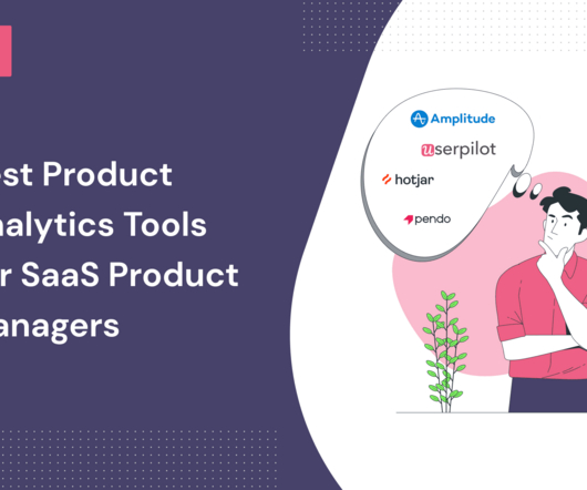
In the blog, we look at 4 well-known product analytics tools, their pros, cons, and most suitable applications. 1-hour delay for the analytics to appear on the dashboard. What users say about Pendo G2 reviews show that Pendo users value its analytics, high levels of dashboard customization, and integrations, for example with Zapier.
User Experience (UX) Creating an intuitive and user-friendly interface is vital to engage users effectively. A well-designed dashboard should provide users with easy access to predictions, historical performance data, and personalized settings. Effective feature selection can enhance the accuracy of predictions.
Our platform automatically calculates the results—a glance at the dashboard will show you the percentage of promoters, passives, and detractors. Userpilot’s NPS dashboard. Mixpanel dashboard. Team collaboration dashboard to help your team work together. Custify’s dashboard image. Churnzero’s dashboard.
Userpilot can help you perform customer needs analysis with in-app surveys, advanced segmentation options, and an NPS dashboard. For example, an NPS dashboard can show you the percentage of detractors , the NPS performance progress, and the progress over time. Userpilot NPS dashboard. Userpilot NPS dashboard.
Below is an example of a feature analytics dashboard by Userpilot. You can use this dashboard to determine which features are the most popular among users and which show poor engagement. Feature analytics dashboard in Userpilot. Userpilot ‘s product analytics dashboard. Google Analytics dashboard.
It also offers very similar features to track user behavior: User segmentation and cohort analysis Group analytics for a wholistic account or company-level analysis Custom events Funnel and drop-off analysis Interactive real-time reporting through Live events Impact analysis Custom dashboards Event Tracking Tool: Mixpanel.
To help you make a decision, in this blog, we will go over the specifics of A/B tests in Mixpanel, uncover its pros and cons, and introduce you to a better alternative. You can analyze Mixpanel A/B testing results using analytics dashboards , funnel analysis , and customer segmentation. Run the test and analyze the results.
That can include interactions on mobile apps, your website, social media, or your product dashboard. UI/UX designers: Create more user-friendly experiences by using data gathered from past interactions. Mixpanel’s dashboard demo. Google Analytics dashboard demo. What is digital experience analytics? Google Analytics.
Pendo Dashboard. The data visualization and analysis options in Data Explorer, Dashboards and Reports can feel limited and a bit “canned.” Dashboard in Amplitude. She also likes how easy it’s to create dashboards and data visualizations and share them with team members. What do you dislike about Pendo?
Userpilot is a powerful product growth platform that allows you to collect data for tracking product metrics and offers actionable insights with product analytics dashboards. Upcoming updates on features and events analytics dashboard in Userpilot. You can get dashboards for features & events, users, goals, and more.
Userpilot is your best bet, combining a powerful array of functionality – segmentation, analytics, and a range of UX patterns to choose from – all at a range of reasonable prices. It provides huge amounts of insight to your UX and design teams. Features and Events dashboard in Userpilot. Amplitude dashboard.
User experience (UX) refers to how easy it is for users to accomplish their goals inside the product. User experience (UX) is based on specific user interactions inside the product. It’s made up of the UX and the emotional and perceptual responses that it produces. Goals dashboard in Userpilot. Let’s dive in!
We organize all of the trending information in your field so you don't have to. Join 96,000+ users and stay up to date on the latest articles your peers are reading.
You know about us, now we want to get to know you!
Let's personalize your content
Let's get even more personalized
We recognize your account from another site in our network, please click 'Send Email' below to continue with verifying your account and setting a password.


Let's personalize your content