This site uses cookies to improve your experience. To help us insure we adhere to various privacy regulations, please select your country/region of residence. If you do not select a country, we will assume you are from the United States. Select your Cookie Settings or view our Privacy Policy and Terms of Use.
Cookie Settings
Cookies and similar technologies are used on this website for proper function of the website, for tracking performance analytics and for marketing purposes. We and some of our third-party providers may use cookie data for various purposes. Please review the cookie settings below and choose your preference.
Used for the proper function of the website
Used for monitoring website traffic and interactions
Cookie Settings
Cookies and similar technologies are used on this website for proper function of the website, for tracking performance analytics and for marketing purposes. We and some of our third-party providers may use cookie data for various purposes. Please review the cookie settings below and choose your preference.
Strictly Necessary: Used for the proper function of the website
Performance/Analytics: Used for monitoring website traffic and interactions
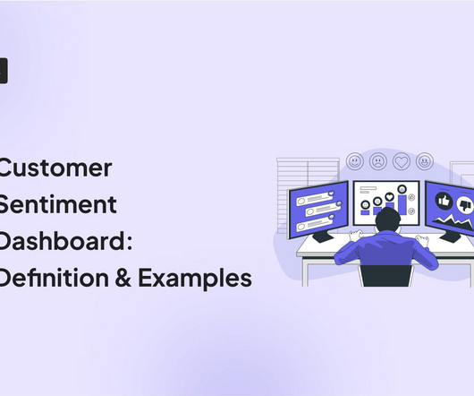
A customer sentiment dashboard is a great way to visualize customer feedback and see what users love (or hate) about your product. TL;DR A sentiment analysis dashboard typically integrates information from multiple data sources, such as social media posts, customer reviews, survey responses , and customer service chats.
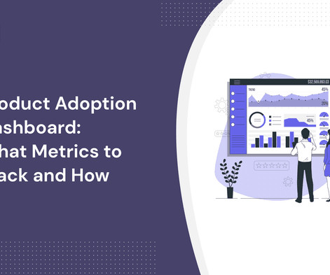
A product adoption dashboard helps you visualize key adoption metrics so you can make data-driven decisions and boost user engagement. In this article, we cover the following: Why you need a product adoption dashboard. Steps to measure adoption using a comprehensive dashboard. Understand how users adopt new features.
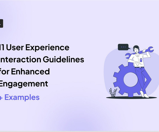
Alongside usability testing, userexperience interface guidelines allow you to build more intuitive and user-friendly solutions. In this blog, we explain eleven userexperience and interaction design guidelines supported by real-life examples to improve product engagement. System status visibility.
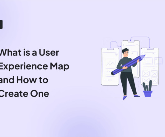
The solution might lie in your ability to create a comprehensive userexperience map. A well-crafted userexperience map can be your secret weapon for understanding customers, identifying pain points, and boosting product engagement. We also identify some best practices to follow when creating the userexperience map.
In this blog, we explore 5 key principles that exist to ensure you create a relevant dashboard that guides and simplifies the userexperience, makes it as easy as possible to interpret what is presented no matter its complexity, and increases the adoption of BI.
Usability vs userexperience – what’s the difference? As a UX designer , you aim to create app designs that facilitate the best experience. While the terms usability and userexperience are used interchangeably, it’s important to know that there’s a difference between the two.
A product analytics dashboard helps you visualize user behavior, so you can make informed decisions on how to improve product engagement. In this article, we cover the following: Why you need an analytics dashboard. The types of metrics to track in your dashboard. The most common analytics dashboards in SaaS.
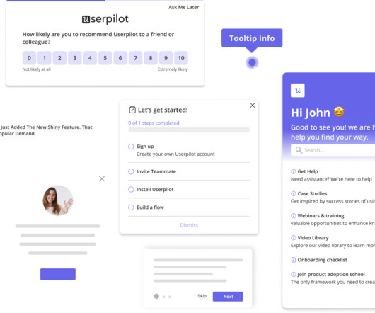
And it’s key to ensuring users continue exploring the tool. Onboarding screens are great for driving users to the Aha moment. This is especially true when they’re used during signup to show dashboard screenshots, positioning messages, etc. Fullstory uses its first screen to collect user data.
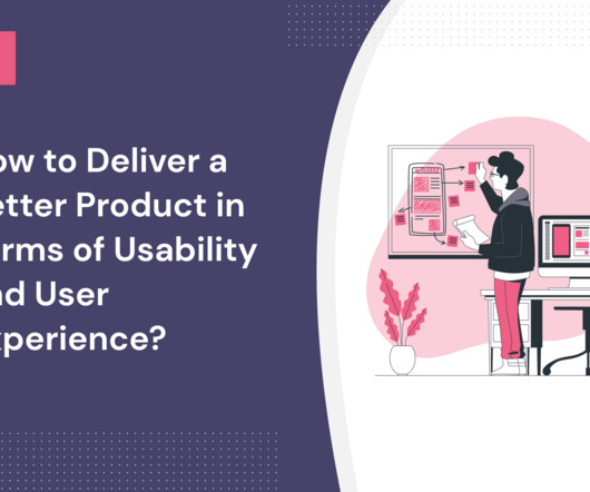
If you’re a UX designer or product manager wondering how to deliver a better product in terms of usability and userexperience, this is the article for you. Start improving userexperience and usability with user research. How do usability and userexperience differ? Let’s get right to it!
Usability testing: Observe users as they interact with your product to identify usability issues and collect feedback on userexperience. E.g., Identify navigation issues in your analytics dashboard based on real-time user interactions. Survey results dashboard in SurveyMonkey. Dashboard example in Hotjar.
They’re also great to gamify the product experience, which psychologically motivates people to push through difficulty or confusion. Blank states are the empty areas in your product dashboard that usually appear when someone uses your product for the first time and hasn’t completed any actions yet.
Notification UX is critical for the success of your communication strategy and customer experience. In fact, a bad notification userexperience can ruin the whole product for the user and even cause churn. Let users have more granular control over your app’s notifications. What are notifications?
UX deals with a user's interactions with specific aspects of your product, while CX is broader and covers all customer engagements with your brand. TL;DR The userexperience (UX) is the sum of a user's thoughts, impressions, and feelings as they interact with specific aspects of your product.
You will also detect crucial friction that hinders the userexperience while analyzing numerous customer touchpoints. You can collect consumer insights by gathering passive and active user feedback. Ask customers to rate how they feel about their experience with feature X and remove the friction if spotted.
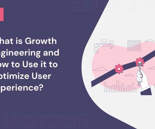
This data makes it easier to optimize product features and improve them to better the userexperience. Ultimately, growth engineering enables SaaS companies to iterate quickly, experiment with possible new solutions, and implement major or minor userexperience improvements. Growth hacking vs. growth engineering.
You can also use them to collect qualitative data , just like in user interviews. Feature flagging is a practice of disabling UI elements to see how they impact userexperience. Userpilot allows you to track product usage, visualize feature engagement with heatmaps and collect user data. User interviews.
Check out the 10-minute video version of this blog post. This blog post maps mental models (now there’s meta for you). Dashboards of user behavior summarizing trends. Usage dashboards are maps that influence what we measure but also how we iterate. Prefer watching your insights? Executives are pushing urgency.
We were so inspired by Tali’s enthusiasm that we just had to share her story here on the Product Talk blog. Tali was so excited to share her experience with opportunity solution trees, she led a workshop at UXDX in Dublin. Do you have your own Product in Practice you’d like to share? You can submit your story here.
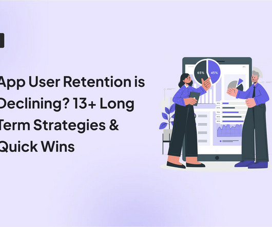
Things seem great initially, but soon enough, you see your analytics dashboard showing a constant decline. Many product teams know this feeling: mobile user retention is dropping, even after big updates and splashy feature releases. Frequent app crashes: Technical glitches or slow load times disrupt the user journey.
Some examples are: Dashboards are cluttered Or the insights are too superficial No option to drill down into data Insights aren’t adjusted to the user’s role For deep analysis, data export to Excel is the only (time-consuming) option 3. With view-only, static dashboards, customers have no control over the insights they can extract.
They combine quantitative and qualitative data to help businesses understand the big picture of their userexperience. As the name implies, FullStory auto logs all aspects of users’ interactions such as scroll, swipe, click, and pageview. The dashboard’s widget wizard contains a library of pre-configured dashboards.
Stay focused on the metrics that are closely related to your goals to avoid unnecessary implementation effort and dashboard clutter.” Kerry Rodden, a UserExperience Researcher at Google says in a blog post on Google Ventures’ blog. Do you really need to track them over time, or is a current snapshot sufficient?
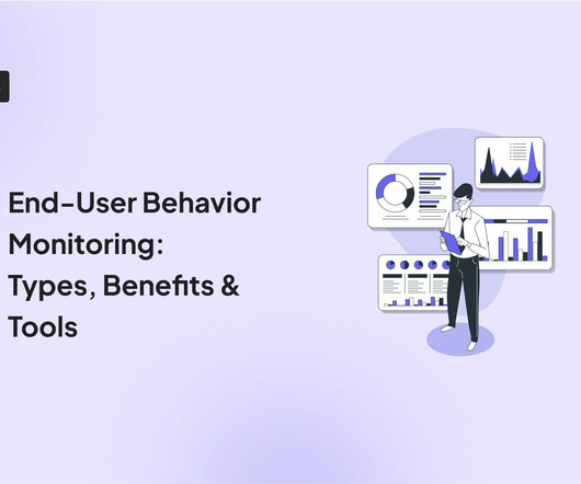
Understanding how end-users interact with your product is crucial to identifying userexperience bottlenecks. It also helps identify better ways to engage users. When combined with product analytics , end-user behavior monitoring can help you boost product usage and retention rates. Book a demo now to get started.
They don’t just crunch numbers; they translate their findings into clear and compelling stories through reports, dashboards, and presentations. BI Analyst (3-5 Years) : You’ll take on more responsibility for independent data analysis, report creation, and dashboard development.
Intercom’s blog is the growth engine that powers much of Intercom’s marketing and it in turn is powered by WordPress. WordPress lets users build everything from blogs to full-blown websites with 100s of themes to choose from. WordPress – CMS. In fact, WordPress powers over 32% of all the websites on the Internet.
Product analytics tools : Platforms that allow you to track and analyze user interactions within a product to help you optimize the userexperience and improve product performance. Try Userpilot’s Product Feedback Software to Optimize Your UserExperience Get a Demo 14 Day Trial No Credit Card Required 2.
Some of its key features include: Custom dashboards : You can effortlessly create custom dashboards to track metrics relating to your in-app product marketing campaigns, such as feature adoption rates , activation rates , upsell rates, etc. Track product growth metrics with a custom Userpilot dashboard. The MailChimp Dashboard.
UserExperience (UX) Creating an intuitive and user-friendly interface is vital to engage users effectively. The userexperience encompasses how users interact with the platform, access predictions, and customize their settings. A seamless and enjoyable user interface encourages user retention.
So let’s see how you can collect customer feedback for analysis and understand user sentiment to improve the userexperience. TL;DR Survey analytics is the process of interpreting user feedback from surveys to gain actionable insights and identify improvement opportunities. What is survey analytics?
TL;DR Hubspot’s product analytics software provides you with reports and dashboards for tracking your marketing campaigns. Designed primarily as a marketing dashboard, this tool is great for understanding your traffic sources and page performance. Unlock marketing insights with Hubspot’s easy-to-use dashboard.
UX click tracking helps you understand how users engage with your web app — what UX elements they find enticing, what part of a feature seems challenging to interact with, etc. In a nutshell, UX analytics gives you data on userexperience to recognize obstacles in the user flow and fix them. Go to the Userpilot dashboard.
The overall userexperience. Promoting new features to your users with Userpilot. For example, include product tours , blogs, FAQs, video tutorials , etc. This includes regularly monitoring product analytics metrics to measure progress and visualizing data using analytics dashboards to draw valuable insights.
For additional information, you might like to read Barry Schiffer’s blog on this functionality [link] or the documentation on Remote Control Actions [link]. We’ve got a popular blog post about helpdesk integration considerations available: Service and Help Desk Automation Strategies | eG Innovations.
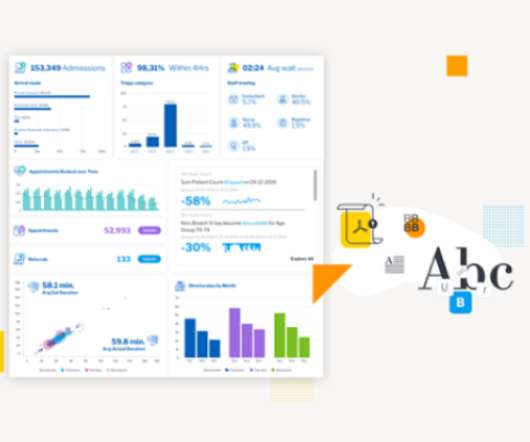
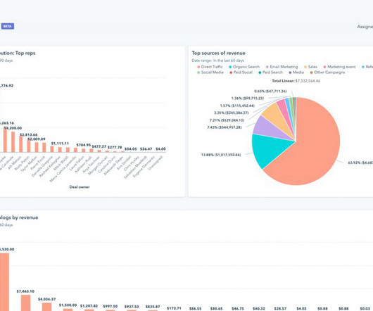
The actionable insights from the analyses will help you better understand the user journey, improve your company’s bottom line, and optimize the userexperience. Below is an example of a feature analytics dashboard by Userpilot. Feature analytics dashboard in Userpilot. Google Analytics dashboard.
In this blog post, well break down Pendos pricing structure, expose its hidden costs, and compare it to a better alternative: Userpilot. Pendo is a software that helps businesses understand user behavior, collect feedback, and drive feature adoption. Personalize userexperiences. Enhance mobile experiences.
The algorithms ‘learn’ about user behavior patterns and all the adjustments to the userexperience happen automatically. To comply with legal requirements, you need to store user data securely. As a result, the solutions are ready and present themselves at the exact moment the userexperiences the need.
How can product managers leverage event analytics to gain insights necessary to build valuable and delightful userexperiences? TL;DR In product management , event analytics tracks and analyses user engagement with different aspects of your product. Features & Events dashboard in Userpilot. Want to see how?
Many companies choose Mixpanel A/B testing to run their product experiments. To help you make a decision, in this blog, we will go over the specifics of A/B tests in Mixpanel, uncover its pros and cons, and introduce you to a better alternative. There are three main ways to visualize your A/B testing metrics with Mixpanel: Dashboards.
Here are some ways tech PMs can use and benefit from Userpilot: Create code-free in-app surveys to collect user feedback and make data-driven decisions. Track key product metrics with analytics dashboards. Identify friction points in the userexperience using funnel analysis and path analysis.
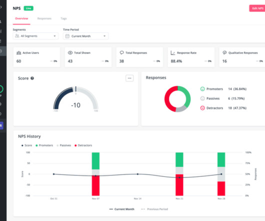
To improve user retention, you can use Userpilot to execute the following strategies: Offer contextual in-app guidance. Track and analyze user behavior. Segmenting existing customers to personalize userexperiences. NPS analytics dashboard. Use path analysis to remove friction points. What is customer acquisition?
Unify your data to deliver better customer experiences : You can combine data using the flexible and customizable HubSpot marketing dashboards to see the initiatives that yield the best results for your business. For instance, the dropdown menu will show the names of specific blogs or landing pages where the CTA is.
In the blog, we look at 4 well-known product analytics tools, their pros, cons, and most suitable applications. Analytics software is an application that enables you to collect user behavior data , filter it, and analyze it. 1-hour delay for the analytics to appear on the dashboard. What is product analytics software?
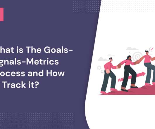
Want to know how the goals-signals-metrics process can be used to create a better userexperience? Let’s go over how you can effectively use the GSM process to improve your userexperience. Originated at Google, the goals-signals-metrics (GSM) process helps a product team create a smooth userexperience.
TL;DR Product analytics is the process of collecting and analyzing data about product usage and user behavior. Product analytics tools empower teams to make informed decisions on how to add more value and offer a better userexperience. Pendo Dashboard. How can a product analytics tool help you drive product growth?
We organize all of the trending information in your field so you don't have to. Join 96,000+ users and stay up to date on the latest articles your peers are reading.
You know about us, now we want to get to know you!
Let's personalize your content
Let's get even more personalized
We recognize your account from another site in our network, please click 'Send Email' below to continue with verifying your account and setting a password.


Let's personalize your content