This site uses cookies to improve your experience. To help us insure we adhere to various privacy regulations, please select your country/region of residence. If you do not select a country, we will assume you are from the United States. Select your Cookie Settings or view our Privacy Policy and Terms of Use.
Cookie Settings
Cookies and similar technologies are used on this website for proper function of the website, for tracking performance analytics and for marketing purposes. We and some of our third-party providers may use cookie data for various purposes. Please review the cookie settings below and choose your preference.
Used for the proper function of the website
Used for monitoring website traffic and interactions
Cookie Settings
Cookies and similar technologies are used on this website for proper function of the website, for tracking performance analytics and for marketing purposes. We and some of our third-party providers may use cookie data for various purposes. Please review the cookie settings below and choose your preference.
Strictly Necessary: Used for the proper function of the website
Performance/Analytics: Used for monitoring website traffic and interactions
A customer sentiment dashboard is a great way to visualize customer feedback and see what users love (or hate) about your product. TL;DR A sentiment analysis dashboard typically integrates information from multiple data sources, such as social media posts, customer reviews, survey responses , and customer service chats.
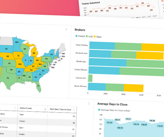
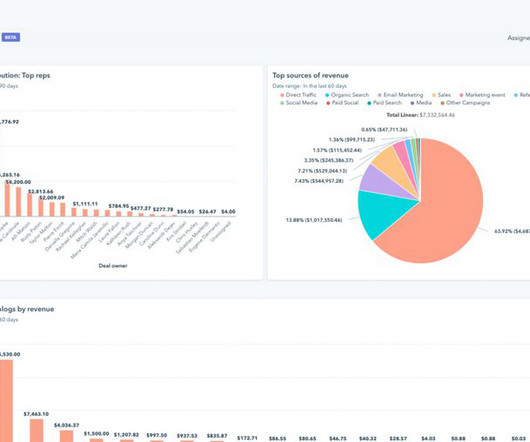
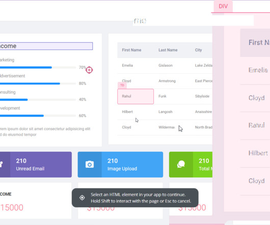
Reveal Embedded Analytics If you’ve ever struggled to create new dashboards with similar KPIs, integrations, and layouts but different data sources, this article is for you. What Are Dashboard Templates? Dashboard templates are pre-designed layouts that provide a framework for organizing and presenting data in a visual format.
In this article, we’ll explore the types of product differentiation strategies and go over cases of real-world brands that have used these strategies to drive product growth. This process grants you a competitive advantage and fosters brand loyalty. Apple differentiates itself through brand image and reputation.
Brand monitoring is a crucial part of any product’s development process. What is brand monitoring? Brand monitoring is the tasks and activities you do that help you track and monitor what people say about your product and brand across multiple channels. How can brand monitoring help your business?
A product analytics dashboard helps you visualize user behavior, so you can make informed decisions on how to improve product engagement. In this article, we cover the following: Why you need an analytics dashboard. The types of metrics to track in your dashboard. The most common analytics dashboards in SaaS.
Wondering how an NPS dashboard can help you track customer loyalty? This is where the NPS dashboard comes in. Let’s see how the dashboard can help you extract insights from NPS responses and improve customer loyalty. What is the NPS dashboard? Why do you need an NPS dashboard?
E.g., Identify navigation issues in your analytics dashboard based on real-time user interactions. Userpilot is one answer, offering data collection and analytics features for quantitative and qualitative data, along with a custom analytics dashboard for visualizing your unique data and responses. Dashboard example in Hotjar.
For a consistent brand image, all of your marketing activities should communicate and reinforce this one statement. Between the message boards, subreddits, and blogs, chances are you can find your existing online communities directly in your niche. DESIGN A DASHBOARD FOR RECORDING AND ANALYZING YOUR METRICS AND KPIS.
In this episode, we sat down with Doug to chat about embracing the mojo and creating a brand strategy that connects with the audience and stands out from the crowd. Here are a few key takeaways: You can usually discover the brand’s voice by talking to the passionate, excited, hard-working employees in your company. Short on time?
TL;DR User sentiment is the feeling a person has about your brand, product, or service quality. Brand24 – best for brand sentiment analysis. User sentiment, also known as customer sentiment, refers to how users feel about a product, service, brand, or even an industry. Sentiment Analysis Examples.
This blog will be sharing some of the most informative and interesting development of web3’s favorite NFT marketplace. NFT dashboard/Storefront The NFT dashboard is a display for all the digital assets in the marketplace, open for the users to trade them. The blog discussed is just the tip of the iceberg.
Unify your data to deliver better customer experiences : You can combine data using the flexible and customizable HubSpot marketing dashboards to see the initiatives that yield the best results for your business. For instance, the dropdown menu will show the names of specific blogs or landing pages where the CTA is.
In this article, we’ll explore 7 product advertising examples to inspire you—from video ads and social media marketing to events and blogging. Builds trust and positive brand perception by transparently sharing the company’s financials, decision-making processes, and even salaries. Groupize gamification.
Some of its key features include: Custom dashboards : You can effortlessly create custom dashboards to track metrics relating to your in-app product marketing campaigns, such as feature adoption rates , activation rates , upsell rates, etc. Track product growth metrics with a custom Userpilot dashboard. The MailChimp Dashboard.
Customer advocates drive customer acquisition via WOM , bolster brand reputation and visibility, and can offer valuable insights to improve the product. Examples of customer advocacy programs include brand ambassador or affiliate programs. First, they help you increase your brand visibility and acquire new customers.
The centralization promoted by these tools ensures brand assets and marketing materials are easier to find. It also minimizes oversights while maintaining brand consistency across marketing outputs. Store all digital assets (brand statements, strategy documents, content resources, etc.) Event trend overview in Userpilot.
However, the Basic package has strict limitations like only 1 user seat and no custom branding. You can fully customize all creations to reflect your company’s branding. UserGuiding’s dashboard. Both Appcues and Chameleon charge more than UserGuiding which can be justified to a certain extent by their additional offerings.
And they all had told me over various conversations about different things they had to do for their business but didn’t like doing: uploading blog posts to WordPress, adding products to their Shopify store, contacting writers to gather blog posts for the next edition of their newsletter. Val: Well, a welcome email.
Social listening tools : Software for monitoring online conversations, brand mentions, and trends. Best for : Monitoring brand mentions across the web and social media. Basically, you can use it to track all instances where your brand, products, or related keywords are mentioned online. Product feedback software: Mixpanel.
To overcome barriers to success in the industry, teams within gaming companies need to look beyond the immediate moment — to work smarter, not harder , to uncover timeless stories that build brand equity while contributing to valuable growth metrics. Launch – Deploy your model into a live environment. freemium to paid subscriptions).
In this blog post, well break down Pendos pricing structure, expose its hidden costs, and compare it to a better alternative: Userpilot. Leverage cross-app executive dashboards and journey orchestration to refine engagement strategies. Heres what that looks like in action: Pendo dashboard showing in-app message pop-up.
15 creative customer engagement ideas: Personalize the customer experience by tailoring onboarding flows, dashboards, and messaging to specific user personas. Improve brand engagement by leveraging customer testimonials as social proof and to reinforce loyalty. Here are the top 5.
Delighted Dashboard. Multiple interactive survey templates, with 12 different question types As well as email, surveys are shareable via SMS, embed codes, web widgets, and even APIs Comprehensive analytics suite with multiple dashboards Multi-language support. Feedier Dashboard. Promoter Dashboard. Wootric Dashboard.
Here are the key features to look for in an analytics tool: segmentation, tracking capabilities, A/B testing , and data visualization with analytics dashboards. Mixpanel is a marketing analytics tool that imports data and transforms it into visual and interactive dashboards. A/B tests are excellent tools for instant customer feedback.
You can enhance HubSpot’s custom reports and dashboards with product and user behavior data tracked in Userpilot to gain a comprehensive understanding of customer needs and preferences. All the data is relayed in real-time so all the reports and dashboards will be up-to-date. Hubspot custom dashboard.
TL;DR Hubspot’s product analytics software provides you with reports and dashboards for tracking your marketing campaigns. Designed primarily as a marketing dashboard, this tool is great for understanding your traffic sources and page performance. Unlock marketing insights with Hubspot’s easy-to-use dashboard.
It’s good to have a range of content like launch blogs and videos. You’ll also want to make sure your marketing team has all the information they need to create ad campaigns (for large pushes), publish content on the blog, and communicate the benefits of the new product to prospects.
Practical tips and examples of onboarding designed by some top SaaS brands. This is especially true when they’re used during signup to show dashboard screenshots, positioning messages, etc. Asana uses customer data to create personalized dashboards and ease the user journey. SaaS onboarding process. Collect relevant data.
Looking for customer relationship management examples to inspire your brand? The software allows you to work with multiple social media platforms from one dashboard. Utilize it to connect with customers, deliver product updates, listen to what people say about your brand, and so on. Engagement analytics on Userpilot’s dashboard.
Using Amplitude’s dashboards, you can get a bird’s eye view of all your relevant charts. Amplitude is a Digital Optimization System used by the most highly valued brands and disruptive teams to better understand and personalize their digital products in order to maximize the business value of their product innovation. Email reports.
Increase your brand awareness in the Reach stage using growth loops that turn customers into business advocates. The “Reach” stage is the brand awareness stage with a focus on activities that build the awareness and visibility of your brand, products, and services. NPS response dashboard. Reach stage.
Think about when they’re normally active on your app or program, or how often they might like to receive blog articles, news or updates from friends. In order to compete with notifications such as messages from friends, family and coworkers, push notifications from brands must pay attention to the smallest details. Just keep testing!
In this blog post, we’ll dive into the key highlights, with a particular focus on two standout features: custom visualizations and interactive chart filtering. DIY Custom Visualizations with Reveal With this innovative addition to our platform, you can now control the chart types available within your dashboards.
That’s why this blog post shows you how to measure CSAT. Improved brand perception. And the latter is the main reason customers prefer one brand over another. It’s easier for this customer segment to become loyal brand ambassadors. And you never know their happiness level unless you test it.
Alchemer Pulse has been developed to answer the big question all businesses want to know: “What are my customers thinking and feeling about my brand?” The algorithms are trained on billions or even trillions of parameters from myriad places including articles, blog posts, books, Wikipedia and other internet resources.
Some best practices for creating NPS follow-up questions include personalizing the follow-up questions, using branding colors, localizing the question, and adding a “Thank You” page. Use branding colors to relate to more customers. You can use branding colors in the NPS follow-up questions to relate to more customers.
You can also tailor your walkthroughs and tours to your brand and product offerings without any prior coding knowledge. UserGuiding dashboard. After publishing your content, you can see all user interactions related to it on the analytics dashboard. Userpilot dashboard. Let’s see. UserGuiding guide analytics.
Reasons for seeking out Typeform alternatives vary from pricing concerns to the need for better branding options, more payment integrations, greater ease of use, etc. SurveyMonkey offers extensive customization and branding options. Userpilot NPS Dashboard. Analyze survey responses on a simple dashboard.
In this article, we’ll go over some concept testing examples from some of the best B2B and B2C brands to help you get started with your strategy. How brands use concept testing: Todoist conducted 30-minute interviews with users to validate a new feature. Get feedback on different messaging and ads to find which resonates.
This loyalty translates into repeat purchases, subscription renewals , and brand advocacy. For example, include product tours , blogs, FAQs, video tutorials , etc. This includes regularly monitoring product analytics metrics to measure progress and visualizing data using analytics dashboards to draw valuable insights.
Our platform automatically calculates the results—a glance at the dashboard will show you the percentage of promoters, passives, and detractors. Userpilot’s NPS dashboard. You can customize the resource center to suit your brand and also add as many elements as you want—videos, help docs, chat, etc. Mixpanel dashboard.
It’s a scientific study in human psychology and empathy, the science of knowing what words will help people understand and connect with your brand and product. As I’ve seen it applied, most keyword research is used to create a laundry list of blog posts to create words to fit into a sales page, so Google Search prioritizes your work.
Userpilot can help you perform customer needs analysis with in-app surveys, advanced segmentation options, and an NPS dashboard. Some examples of customer needs and wants include customer pain points, brand image, product features and functionality, price, and user-friendly experiences. Userpilot NPS dashboard.
Increased customer loyalty is a major competitive advantage so building brand loyalty by increasing satisfaction scores should always be a priority. For instance, you could use an NPS dashboard to look at response rates for NPS surveys and the percentage of promoters versus detractors. Increase customer lifetime value and retention.
We organize all of the trending information in your field so you don't have to. Join 96,000+ users and stay up to date on the latest articles your peers are reading.
You know about us, now we want to get to know you!
Let's personalize your content
Let's get even more personalized
We recognize your account from another site in our network, please click 'Send Email' below to continue with verifying your account and setting a password.
Let's personalize your content