This site uses cookies to improve your experience. To help us insure we adhere to various privacy regulations, please select your country/region of residence. If you do not select a country, we will assume you are from the United States. Select your Cookie Settings or view our Privacy Policy and Terms of Use.
Cookie Settings
Cookies and similar technologies are used on this website for proper function of the website, for tracking performance analytics and for marketing purposes. We and some of our third-party providers may use cookie data for various purposes. Please review the cookie settings below and choose your preference.
Used for the proper function of the website
Used for monitoring website traffic and interactions
Cookie Settings
Cookies and similar technologies are used on this website for proper function of the website, for tracking performance analytics and for marketing purposes. We and some of our third-party providers may use cookie data for various purposes. Please review the cookie settings below and choose your preference.
Strictly Necessary: Used for the proper function of the website
Performance/Analytics: Used for monitoring website traffic and interactions
Without effective UX analytics that goes beyond collecting data, you’re losing valuable customers. This article will help reduce such churn by refining your product management and UX analysis approach. It covers key topics, such as: Defining UX analytics. Why UX analytics should go beyond quantitative data.
Learn about the importance of mobile app KPI dashboards and copy dashboards from real mobile app product managers, engineers and designers. A key performance indicator (KPI) dashboard is a visual representation of data that quantifies how well a team is performing towards its goals. How do I create a mobile app KPI dashboard?
Example: Imagine you’re designing a new dashboard for a fintech app. Example: For our dashboard, we might ask, “How might we create a dashboard that helps analysts quickly spot trends and take action?” Teresa Cain has cracked the code with her two-hour design sprint method. Big difference, right?
A customer sentiment dashboard is a great way to visualize customer feedback and see what users love (or hate) about your product. This article shows you a step-by-step process and some of the best tools to use. Customer sentiment dashboards help you generate the following: Sentiment trends over time. Sentiment distribution.
Custom dashboards to track key metrics at a glance. Pendo The dashboard on Pendo. Additional reports: You get a built-in Product Engagement Score dashboard. Lack of templates: There arent many ready-to-use dashboards or templates to get started quickly. UserGuiding dashboard. for collecting user sentiment data.
A little investigative research on G2 uncovered the top 5 analytics UX mistakes made by SaaS vendors. Users describe this overall poor UX experience in multiple ways: A time-consuming process Too difficult to learn Clunky and confusing interface Insights are spread out across multiple sections 2.
This article will help you decide. It captures every click, scroll, mouse movement, or keystroke to help you understand user behavior, identify friction points , and improve UX. Teams can use Fullstory’s session replay to: Identify frustration signals like rage clicks or dead clicks to uncover UX pain points. Fullstory pricing.
This article aims to simplify the decision-making process. Hotjar – Best for product managers, UX designers, and marketers – Free plan available; paid plans start at $32/month. Smartlook – Best for product managers, UX researchers, and mobile app developers – Free plan available; paid plans start at $55/month.
In this article, we’ll help you pick the right customer success program, covering aspects like: Tips for choosing the right customer success platform. Reporting and dashboards for outcome tracking. Reporting and dashboards for keeping a real-time pulse on customer sentiment. Reporting and dashboards.
If you’ve landed on this article, you most likely already understand the immense value of capturing in-app customer feedback. Appsee is a mobile app analytics platform that focuses on qualitative data and is designed to help inform UX decisions. Where do you start? What tools do you use? How do you manage all of that data?
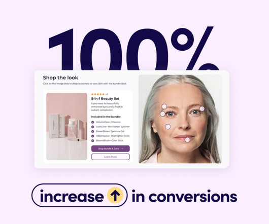
This case study reveals how Rumi Cosmetiques doubled its conversion rates and saw a 75% increase in adds to cart within a week, thanks to strategic changes in their user experience (UX) design and conversion rate optimization (CRO). An expertly crafted UX design ensures that customers glide through your site like butter on a hot skillet.
Analytics dashboards are visualization tools that give you an overview of key metrics. In this article, we’ll discuss 10 analytics dashboard examples. It will give you a better understanding of the type of metrics to monitor in your dashboard and help you draw product growth insights from them. Book a demo to learn more.
Read this article to discover 17 UX design principles to drive customer satisfaction and loyalty. TL;DR UX design identifies user needs, wants, and pain points and creates engaging products that enable them to achieve their goals. UX design principles are guidelines that aid the process. Let’s dive right in!
How do you write a UX microcopy that helps users accomplish their objectives and drives conversions? That’s what our guide to microcopy in UX design covers, so if you’re after the answer, you’re in the right place! What is microcopy UX? Why is it important to write a great UX microcopy?
A good SaaS UX design is critical to a successful SaaS product in today’s constantly evolving and competitive market. In this article, we will examine what an effective SaaS UX design is, why it’s important, and the best practices to produce a well-crafted design that works. What is SaaS UX design?
This is why conducting a UX audit is so important – to understand where the user experience is lacking and why. But the question is, how do you conduct a UX audit, what quantitative data should you look at, and what does a good UX design even look like? Study behavior trends to highlight any UX designs users avoid.
What is the UX research process? These are only some of the questions that the article tackles. It also outlines a 9-step guide on how to conduct UX research for product managers and UX designers. Each UX research project should start with goal setting and formulating research questions. Why is it important?
While I spoke with Claire and Christophe for this article, we’ll also hear a bit about other continuous discovery champions from Botify. But Christophe suggested that they map out all the tasks between PMs, UX, and UI (they had both distinct roles at that stage). There was no ill intent, just that silos reassure older organizations.”
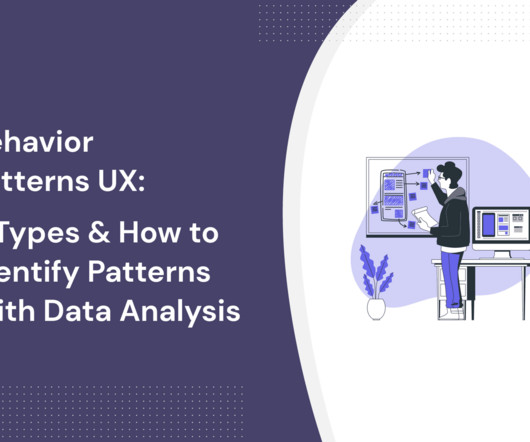
Looking for ways to uncover behavior patterns (UX) and optimize your product experience? In this article, you’ll learn: Behavioral design principles to incorporate in your user interface and experience. Step-by-step process to perform behavioral pattern analysis and improve your UX. Product usage dashboard in Userpilot.
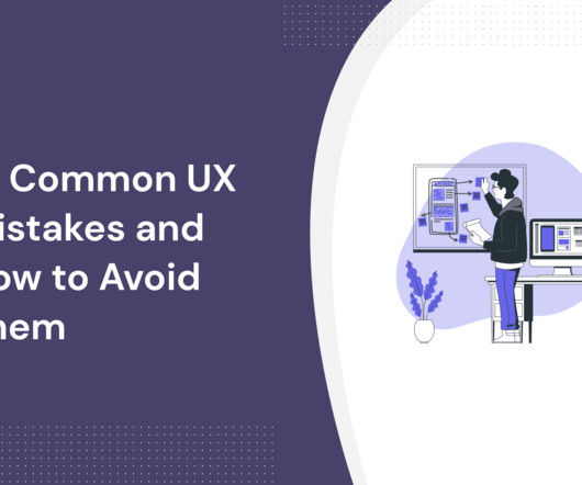
UX mistakes will disrupt the user experience and undervalue your product. This article shows you 14 common UX mistakes designers make, plus how to avoid them and build fantastic product experiences. Optimizing for search engines and not humans While SEO is important, it shouldn’t come at the expense of good UX.
DESIGN WORKBOOKS How to put design theory into practice in an efficient way My favorite UX design workbooks: develop your skills by solving exercises Learning design theory is a good step towards becoming a better designer, but it is also important to put the things you’ve learned into practice.
Understanding data visualization UX best practices is key to creating compelling visuals that produce digestible insights, empowering users to make informed product management decisions. In this article, we examine the six-step process to creating effective visuals and best practices that can elevate the quality and impact of your visuals.
This article will walk you through what customer research really is, from choosing your research methodology to recruiting participants, analyzing feedback , and beyond. E.g., Identify navigation issues in your analytics dashboard based on real-time user interactions. Survey results dashboard in SurveyMonkey.
What's the difference between UX vs CX? UX deals with a user's interactions with specific aspects of your product, while CX is broader and covers all customer engagements with your brand. Read on to find four key differences between UX and CX and how to improve both. That's not entirely true.
To prepare for the workshop, Tali created a fictional case study, and with the help of ChatGPT, she generated six interview snapshots and some analytics dashboards. If you are not reading this article in your feed reader, then the site is guilty of copyright infringement. Please let us know at support@producttalk.org.
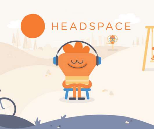
Headspace app is one of such rare Apps and is the topic of this article. However neither its meditation nor its fun UX and quirky animations are the topic of this article. A pioneer in the literature related to Habit-forming products. However before explaining the term ‘Facilitator’ let us quickly get to know what Headspace is.
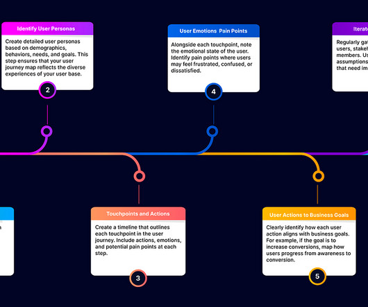
Example: User Journey Map Infographic In this article you are going to know below points on User Journey Map 1. Where to do user journey map in the UX process ? Where to do user journey map in UX process Discovery and Research Phase: Objective: Understand user needs, pain points, and behaviors. Type of user journey maps 4.
You don’t want to send project managers on the ideal path for UX designers, after all. For example, let’s say a $100k ARR company (enterprise subscriber) reports their custom SSO integration is failing, a $10k ARR company reports dashboard loading slowly, and a $1k ARR company reports an issue with a new feature.
Unfortunately, that technology isn’t here yet, so UX research tools are the next best thing. This article will highlight 23 of the best UX research tools available in 2024. TL;DR UX research tools help collect and analyze data on user interactions to improve product usability and satisfaction.
Jess shared the specific wording she used that ultimately led to replies: Subject: UX Research chat about Sustainability? Hi <name> My name is Jess and I’m a UX Researcher based in Melbourne. If you are not reading this article in your feed reader, then the site is guilty of copyright infringement.
In this article, we will go over 5 of the best FullStory alternatives on the market, explain what each one does best and how they compare to help you narrow down your choices. As a mobile-friendly solution, UXCam’s offers push notifications, so your support and UX teams can connect with specific user segments more easily.
This article shares exciting mobile product manager roles and showcases standout candidates in the field. Youll blend the strategic mindset of a growth product manager with the creative vision of a UX designer – driving repeat engagement, gamification, and social participation. Proficiency in Figma and strong UX & UI skills.
This article will cover: Why combine quantitative, qualitative, and visual data? ” NPS Survey Dashboard in Userpilot. Userpilot event tracking dashboard identifying user trends and drop-offs. Lisa, our UX researcher who shared the same struggle, has utilized Userpilot to find suitable candidates for interviews.
User analytics: The custom analytics dashboard provides a centralized view of customer data, allowing you to segment, filter, and analyze user behavior. Analytics dashboard in Userpilot. Customization options Pendo provides limited customizations when building dashboards, creating surveys, or reporting customer data.
In this article, we will dive deep into the fascinating world of human memory and uncover practical insights that can enhance your design process. Here are some key characteristics of human memory and tips on how to apply them in your UI/UX designs. People may need help retaining information about the flow, buttons, and actions.
In this article, we will outline the typical journey for business intelligence analysts, covering educational requirements, entry-level positions, potential advancements, and long-term opportunities. BI Analyst (3-5 Years) : You’ll take on more responsibility for independent data analysis, report creation, and dashboard development.
Try Userpilot’s Mobile App Engagement Platform for Enhanced UX Get a Demo 14 Day Trial No Credit Card Required Key benefits for product teams Product managers Maintaining feature consistency between web and mobile onboarding experiences can be tough, and any mismatch confuses users.
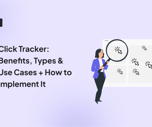
This article will show you different types of click trackers, benefits, and use cases + how to automatically track customer clicks with Userpilot for more effective product analytics. A click tracker is a tool used for UX tool tracking that records and analyzes where users click in your app or on your website, landing page , or email.
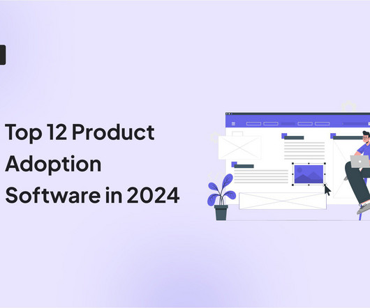
In this article, we explore what product adoption software does and identify 12 of the best product adoption tools on the market. Analytics dashboard : Track all your adoption-related metrics in one simple dashboard. Userpilot analytics dashboard. Whatfix analytics dashboard. Walnut demo analytics dashboard.
Card layout The card layout trend is relatively new in UX design (popularized by Facebook and Twitter) but has already won many supporters. Check this article to find some event ideas Example of mobile app storyboarding UXCam funnel showing the checkout flow of an e-commerce app. Need some inspiration? Need some inspiration?
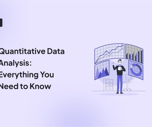
In this article, we explore what quantitative data analysis is, the difference between quantitative and qualitative data analysis, and statistical methods you can apply to your data. With Userpilot , you can auto-capture in-app user interactions and build analytics dashboards. Core features engagement dashboard view in Userpilot.
If so, you’re in the right place because that’s what this article explores! Like Appcues, Userpilot allows you to track goals from the Goals dashboard after you set them from the Chrome extension. The NPS dashboard in Userpilot is more detailed. Appcues analytics: NPS dashboard. What can you do with Appcues analytics?
Additionally, good tools allow you to visualize data through different dashboards, charts, or graphs. Analytics dashboards : Track key metrics such as active users , number of sessions , average session duration, or feature adoption within a singular, accessible hub. Userpilot’s analytics dashboard. Customer segmentation.
Additionally, sentiment analysis tools can gauge market sentiment by analyzing social media, news articles, and forum discussions. User Experience (UX) Creating an intuitive and user-friendly interface is vital to engage users effectively. This data can be invaluable in predicting market movements.
We organize all of the trending information in your field so you don't have to. Join 96,000+ users and stay up to date on the latest articles your peers are reading.
You know about us, now we want to get to know you!
Let's personalize your content
Let's get even more personalized
We recognize your account from another site in our network, please click 'Send Email' below to continue with verifying your account and setting a password.


Let's personalize your content