This site uses cookies to improve your experience. To help us insure we adhere to various privacy regulations, please select your country/region of residence. If you do not select a country, we will assume you are from the United States. Select your Cookie Settings or view our Privacy Policy and Terms of Use.
Cookie Settings
Cookies and similar technologies are used on this website for proper function of the website, for tracking performance analytics and for marketing purposes. We and some of our third-party providers may use cookie data for various purposes. Please review the cookie settings below and choose your preference.
Used for the proper function of the website
Used for monitoring website traffic and interactions
Cookie Settings
Cookies and similar technologies are used on this website for proper function of the website, for tracking performance analytics and for marketing purposes. We and some of our third-party providers may use cookie data for various purposes. Please review the cookie settings below and choose your preference.
Strictly Necessary: Used for the proper function of the website
Performance/Analytics: Used for monitoring website traffic and interactions
Three new dashboards for conversations, support effectiveness, and team performance give you the ability to see what type of issues are taking up the most time, monitor your team’s workload, and optimize your support team’s performance. Easily manage and measure the impact of your help docs with our new Articles API.
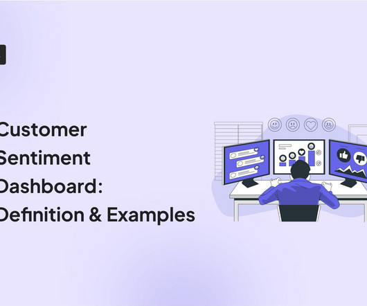
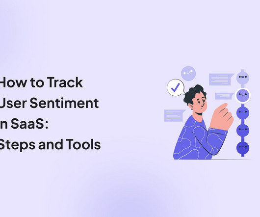
A customer sentiment dashboard is a great way to visualize customer feedback and see what users love (or hate) about your product. This article shows you a step-by-step process and some of the best tools to use. Customer sentiment dashboards help you generate the following: Sentiment trends over time. Sentiment distribution.
This article will help reduce such churn by refining your product management and UX analysis approach. Like most articles you’ll find online, our article mentions several analysis methods too. Dashboard : Customize the analytics dashboard or choose from pre-built ones to easily visualize and compare key metrics over time.
Reveal Embedded Analytics If you’ve ever struggled to create new dashboards with similar KPIs, integrations, and layouts but different data sources, this article is for you. What Are Dashboard Templates? Why Care About Dashboard Templates?
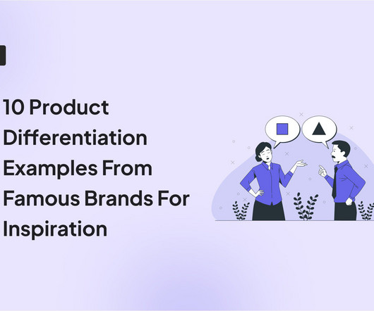
In this article, we’ll explore the types of product differentiation strategies and go over cases of real-world brands that have used these strategies to drive product growth. This process grants you a competitive advantage and fosters brand loyalty. Apple differentiates itself through brand image and reputation.
A product analytics dashboard helps you visualize user behavior, so you can make informed decisions on how to improve product engagement. In this article, we cover the following: Why you need an analytics dashboard. The types of metrics to track in your dashboard. The most common analytics dashboards in SaaS.
Enter Rumi Cosmetiques , a brand that aced the eCommerce game by doing precisely this. Spoiler alert: it worked wonders, demonstrating that when you align your brands digital strategy with your users expectations, you achieve incredible results. Branding also received a fresh coat of paint. Ready to uncover their secrets?
If you’ve landed on this article, you most likely already understand the immense value of capturing in-app customer feedback. Apptimize can help brands create powerful audience segments, identify the cause of conversion funnel drop-offs, and test new features. Where do you start? What tools do you use?
This means using the welcome survey discussed above to learn what users expect from your brand. Gamification involves integrating game mechanics like challenges, rewards, and feedback to boost enthusiasm for your brand. A deep sense of loyalty to your brand ! …and tailored in-app tutorials to introduce core features.
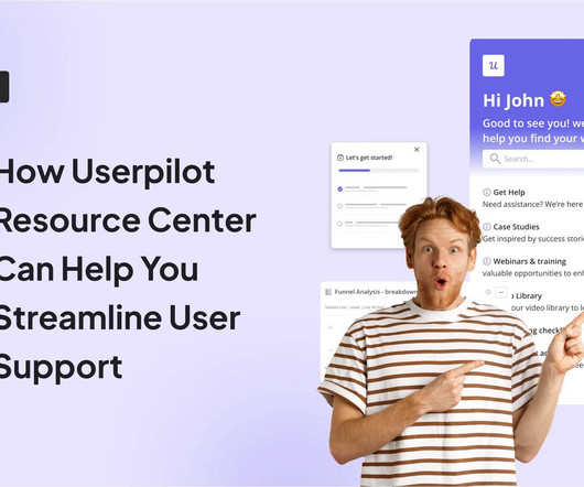
In this article, well dig deeper into Userpilots resource center feature, discuss different use cases, and show you examples from real-world users who benefitted from it. You can customize every element so the look and feel align with your brand image. It helps minimize friction in the user journey and ensures that users reach the Aha!
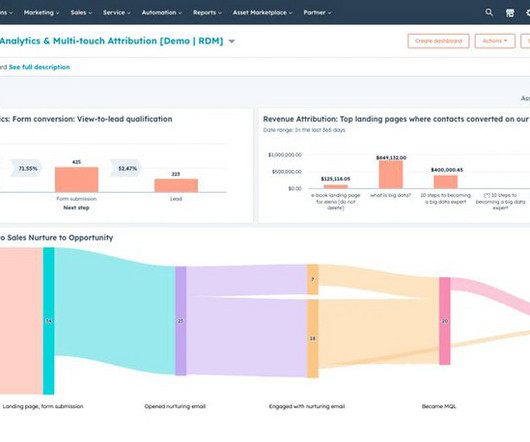
This article will walk you through what customer research really is, from choosing your research methodology to recruiting participants, analyzing feedback , and beyond. E.g., Identify navigation issues in your analytics dashboard based on real-time user interactions. Survey results dashboard in SurveyMonkey.
Doug Kessler is the co-founder and creative director at Velocity Partners , a B2B Marketing Agency with a laser-sharp focus on content strategy, and the writer of articles such as The Search for Meaning in B2B , Crap , and Insane Honesty. Constantly putting out mediocre pieces is hurting your content brand. We know brands with mojo.
Apptimize, An Airship Company, helps brands rapidly iterate to make amazing user experiences across all their digital channels through A/B Testing and Feature Release Management with a mobile-first lens. mParticle is the customer data platform for brands leading the CX revolution. Core mobile in-app feedback tools & solutions.
In this article, we’ll explain what user sentiment analysis is, why it’s important, and uncover some of the best tools for tracking and analyzing customer sentiment. TL;DR User sentiment is the feeling a person has about your brand, product, or service quality. Brand24 – best for brand sentiment analysis.
In this article, we’ll take a look at a few powerful marketing analytics software, focusing on their features and pricing. When it comes to marketing analytics, the following features are useful: Dashboards – You can create custom analytics dashboards using templates or build them from scratch. Dashboards on Userpilot.
This is costly not just for your team’s bandwidth and budget – but also for your customers’ satisfaction and overall perception of your brand. Conversations closed by articles. If someone reads one of our help center articles linked to from a proactive message, they’ll be prompted to let us know whether it answered their question.
Customers who actively connect with your brand are more likely to stay loyal, spend more, and become advocates. Customization options: Can you tailor the platform to match your brand identity and specific needs? Analytics dashboard in Userpilot. Dashboard widgets: This feature is a vital part of Pendos analytics tools.
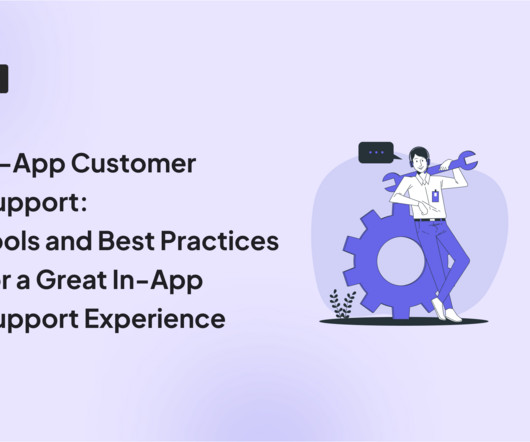
In this article, we’ll break down what in-app customer support is, show you some of the best practices, and check out what you should look for in an in-app customer support automation tool. Knowledge base section that leads to further article categories. Reduce support costs by minimizing the need for human intervention.
In this article, we’ll explore some key metrics, analysis techniques, as well as actionable strategies to track and enhance your product performance. Using analytics tools like sentiment analysis , heatmaps , cohort analysis, and analytics dashboards to track key performance indicators. Sentiment analysis.
If so, this article is exactly what you need! Customer advocates drive customer acquisition via WOM , bolster brand reputation and visibility, and can offer valuable insights to improve the product. Examples of customer advocacy programs include brand ambassador or affiliate programs. Let’s get into it, shall we?
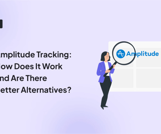
These are the main questions we explore in this article. Catering to businesses of all sizes, it enables teams to track user interactions with the brand at different stages of the customer journey. Amplitude dashboard. Custom analytics dashboard in Userpilot. Event dashboard in GA4. What’s Amplitude tracking?
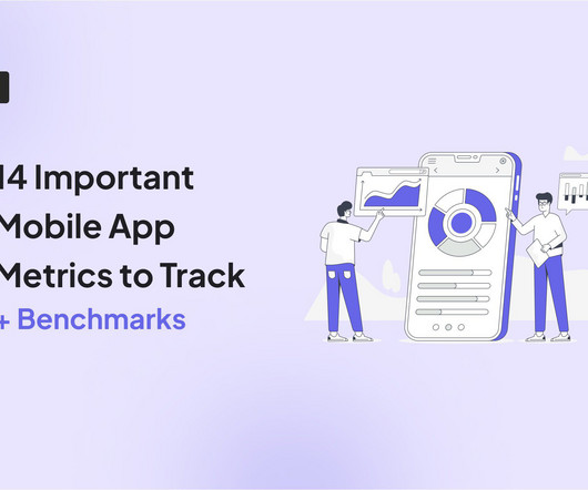
This article will cover 14 metrics to help you achieve just that. A platform like Userpilot allows you to create custom dashboards and measure only the metrics that relate to your goals. Net Promoter Score (NPS) and user sentiment What it measures: User loyalty as well as their emotions, opinions, and attitudes about your brand.
In this article, we’ll explore 7 product advertising examples to inspire you—from video ads and social media marketing to events and blogging. Builds trust and positive brand perception by transparently sharing the company’s financials, decision-making processes, and even salaries. Groupize gamification.
Looking for customer relationship management examples to inspire your brand? This article shows you eight examples and lessons to learn from each. Toward the end of the article, we highlighted the types of CRM systems and different CRM tools that might be helpful to you. Engagement analytics on Userpilot’s dashboard.
In this article, we examine some tools that can help your SaaS team to drive product growth. Some of its key features include: Custom dashboards : You can effortlessly create custom dashboards to track metrics relating to your in-app product marketing campaigns, such as feature adoption rates , activation rates , upsell rates, etc.
Self-service options can include product documentation, educational resources, community forums, help articles, FAQs, and AI chatbots. Main features Add any content format to your self-service portal including video, articles, surveys, checklists, and links to your help center. Zendesk dashboard. Freshdesk dashboard.
This article serves as a UserGuiding pricing guide and discusses better alternatives that might be worth investing in. However, the Basic package has strict limitations like only 1 user seat and no custom branding. You can fully customize all creations to reflect your company’s branding. UserGuiding’s dashboard.
In this article, you’ll learn: The key role and benefits of onboarding screens. Practical tips and examples of onboarding designed by some top SaaS brands. Popular onboarding screen examples (details in the article): Slack: onboarding page for first-time users. Prodpad: onboarding screen for returning customers.
From the article, you’ll learn about different kinds of customer insights (from product analytics and only) and the benefits of gathering them. Monitor and analyze customer activity on social platforms to gain unsolicited feedback and understand brand perception. An NPS dashboard in Userpilot. Your brand perception.
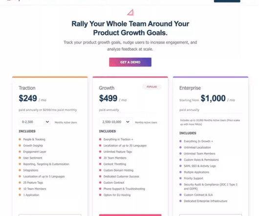
In this article, we’ll break down Userpilot’s pricing plans and review all the features you can find when you choose your specific pricing plan. The Starter plan only gets trend reports and access to analytics dashboards. All plans get engagement reports, weekly digests, and custom branding. Product analytics.
The article shares 20 actionable customer retention strategies for your SaaS! Foster an online brand community to increase loyalty and create competitive advantages. Create a customer retention analytics dashboard to measure success across key metrics. Wondering how to improve customer retention? The solution?
Drag and drop analytics are interactive and user-friendly analytics platforms that allow users to analyze complex data sets and build custom dashboards and reports by themselves when they need them. . Let’s you build custom dashboards and reports in minutes. The drag and drop dashboard creator experience is just the start.
This article provides a detailed guide to help you find the best knowledge-base software solutions so you can provide frictionless experiences to your customers. A knowledge base typically contains frequently asked questions (FAQs), videos, and how-to articles. But how can you make use of it? Let’s dig in!
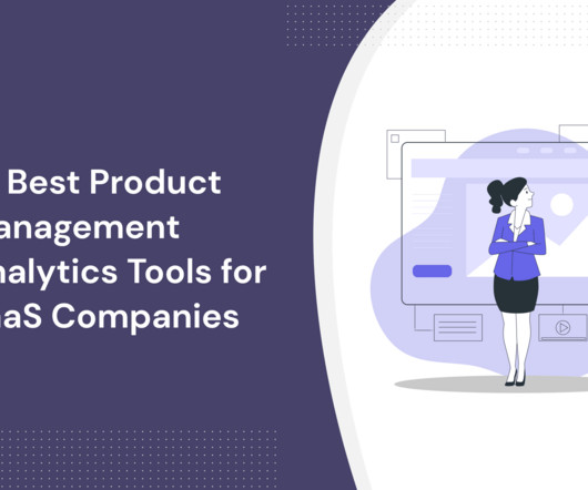
This article will examine some of the best product management software in the market. Whether it’s customizing workflows, dashboards, or reports, the ability to tailor the tool to fit your product development process can significantly enhance your efficiency and effectiveness. Using software for product management.
If yes, this article is exactly what you need! Userpilot offers 4 predesigned analytics dashboards for tracking important metrics in one place: Product Usage , New Users Activation , Core Feature Engagement, and User Retention dashboard. You can also create custom dashboards with up to 30 reports. New Users Activation.
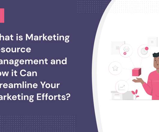
This article highlights how marketing resource management helps streamline processes, organize resources, and enhance workflows for better results. The centralization promoted by these tools ensures brand assets and marketing materials are easier to find. Keep brand consistency across all communications with users.
This article discusses how the HubSpot customer journey analytics reporting tool can help you attract customers and accurately walk them through every step of the customer journey. Device type : allows filtering based on the device a visitor uses when they engage with your brand. CMS Hub Enterprise is available at $1200 per month.
To help you know which tool to use, this article will cover the ten best product analytics tools. A good product analytics tool should offer varied features for measuring customer behavior, integration options, data visualization dashboards, and automatic data capture. Mixpanel product metrics dashboard. Amplitude dashboard.
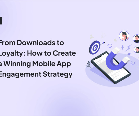
” In this article, I explore that question, highlighting key steps to create a mobile app engagement strategy and the best engagement techniques for mobile apps. Average content (articles, soundscapes, or programs) consumption per user. Userpilot ‘s mobile app performance dashboard. The question is, “How?”
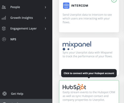
If not, our article will show you 8 ways product managers can leverage the synergy of the two tools to build in-app experiences that drive your product growth. Teams can leverage the integration to identify power users and brand advocates by tracking product usage, feedback data , and HubSpot account or company data.
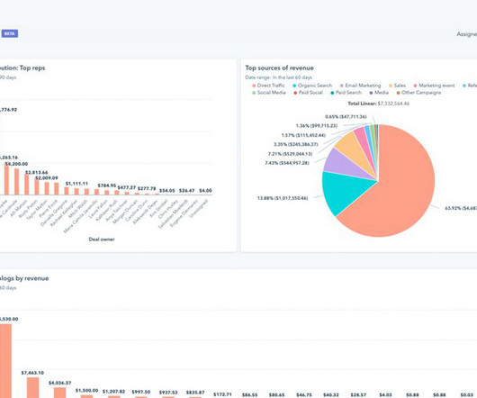
In this article, we examine what you can achieve with the product analytics software from Hubspot. TL;DR Hubspot’s product analytics software provides you with reports and dashboards for tracking your marketing campaigns. Unlock marketing insights with Hubspot’s easy-to-use dashboard.
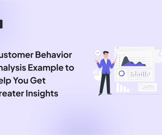
In this article, you will also learn how to conduct customer behavior analysis step-by-step and how Userpilot analytics can help. Userpilot allows tracking user events and features, analyzing data through reports and heatmaps, creating custom dashboards , and collecting feedback through surveys. Userpilot analytics dashboard.
Personalized and engaging experiences not only help customers achieve value faster but also build trust with the brand and ultimately lead to customer loyalty. Additionally, good tools allow you to visualize data through different dashboards, charts, or graphs. Userpilot’s analytics dashboard. Customer segmentation.
In this article, we’ll take you through a list of the top customer intelligence tools. Also, you get custom dashboards to view these reports and filter the data. Custom analytics dashboards and reports like funnel analysis for identifying friction Dashboards in Userpilot. Qualtrics Qualtrics dashboard.
We organize all of the trending information in your field so you don't have to. Join 96,000+ users and stay up to date on the latest articles your peers are reading.
You know about us, now we want to get to know you!
Let's personalize your content
Let's get even more personalized
We recognize your account from another site in our network, please click 'Send Email' below to continue with verifying your account and setting a password.


Let's personalize your content